Common Custom Card Design Mistakes to Avoid If You Want a Premium Result
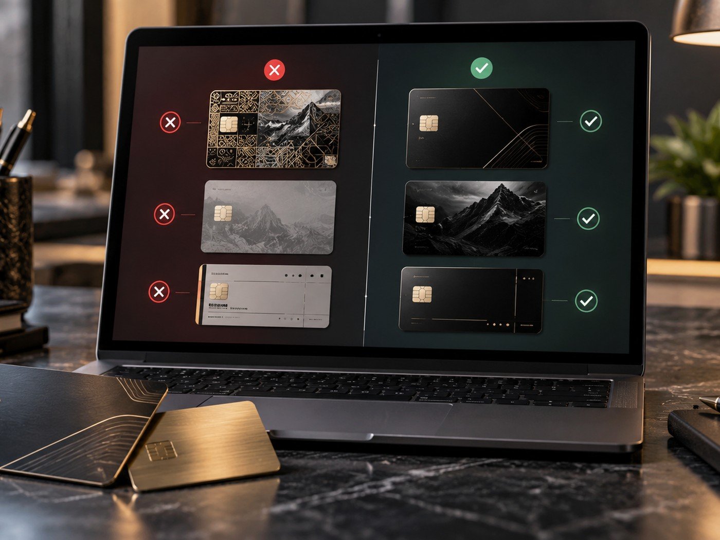
Bad custom card results are usually not caused by bad taste. They are caused by small mistakes repeated in one design: too much information, weak contrast, poor alignment, or low-quality source files. The good news is that these problems are easy to reduce once you know what to watch for.
1. Cluttered layouts
Trying to say too much is the most common card design problem. When the card is filled edge to edge, nothing feels important. Premium design relies on focus, not fullness.
The fix is simple. Remove duplicate information, shorten the text, and give one or two elements permission to lead the design.
2. Weak contrast
A stylish dark surface with slightly darker text may look cool in a mockup, but it fails in real life. The same happens when pale text sits on a pale metallic surface.
Check your color pair with the Color Contrast Checker. If the design is text-led, this step is not optional.
| Mistake | Why it hurts the design | Better direction |
|---|---|---|
| Too much text | No visual focus | Trim the copy and create hierarchy |
| Low contrast | Poor readability | Use clearer foreground and background values |
| Weak image file | Soft or messy output | Start with a better source file |
| Crowded edges | Feels cheap and risky | Respect margins and safe space |
3. Poor file quality
If a logo is pixelated or a photo is blurry, the final card will carry that weakness. Strong materials cannot fix weak files.
Use the Image Cropper, Image Compressor, and image converter to clean up source files before importing them.
Three quick tools that prevent common issues
These tools help reduce some of the most frequent card design problems before the layout even begins.
Helpful tools: Image Cropper · Color Contrast Checker · Image Compressor
4. Small alignment problems
A card can have great colors and still feel weak because the logo, text lines, or decorative shapes do not line up well. Alignment is one of the silent signals of quality.
Zoom out and study the layout as a whole. Ask whether the spacing feels intentional. Often a few small corrections make the whole card look far better.
5. Skipping the review step
Designers often stare at a card until they stop seeing its problems. That is why a final checklist matters. It forces you to look at the card with fresh eyes.
Before placing the order, use our custom metal card order checklist. It helps catch exactly the kinds of issues covered in this article.
Frequently asked questions
What is the most common card design mistake?
Trying to fit too much information into a small space is one of the most common mistakes.
Do premium cards need a lot of effects?
No. Premium cards usually look better when they use fewer elements with more intention.
Can small alignment issues really matter?
Yes. Small alignment problems make a card feel less polished, even when the rest of the design is strong.