QR Code on a Metal Business Card: Best Practices for Placement, Size, and Scannability
A QR code can turn a great-looking card into a more useful tool. It can open a website, a portfolio, a saved contact card, a booking page, or a social profile hub. But the code only helps when it is placed and styled properly.
1. Pick the right destination first
Do not add a QR code just because it looks modern. Add it because it improves the experience. The best QR destination is one that helps the next step happen quickly.
That next step could be saving your contact details, visiting a product page, viewing your portfolio, opening WhatsApp, or booking a call. If the destination is weak, the QR code becomes decoration instead of utility.
2. Choose the best placement
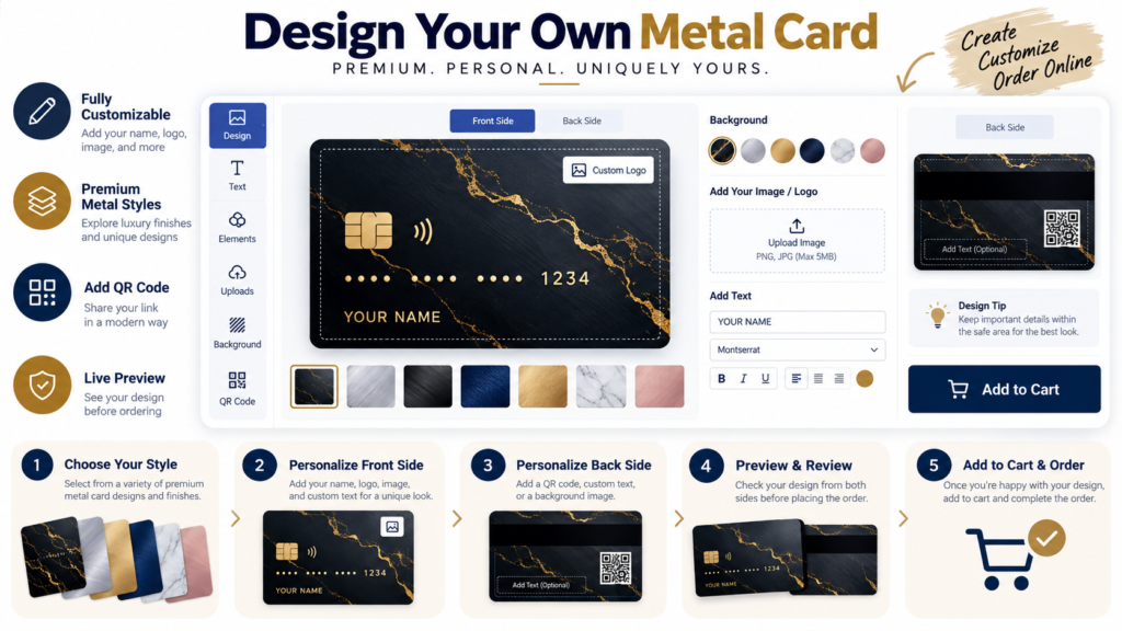
A QR code usually works best on the back of the card or in a corner where it stays visible without dominating the whole design. It should feel integrated, not forced.
If your front side already uses a strong visual or a minimal identity system, keep that side clean and let the back handle the scan function.
| Placement option | Good for | Watch out for |
|---|---|---|
| Back-side corner | Most business cards | Leave enough quiet space around the code. |
| Front lower corner | Minimal front layouts | Make sure it does not break the premium look. |
| Centered back | Digital-first networking | Balance it with strong supporting design. |
3. Use a size that people can actually scan
A beautiful but tiny QR code is not useful. The code needs enough size and contrast to be scanned by real phones under real lighting conditions. It is safer to leave more room than you think you need.
If you need a QR asset, the site menu references a QR code generator, and you can combine that asset with the Image Cropper or Color Contrast Checker to refine its placement and readability.
Keep the QR useful, not decorative
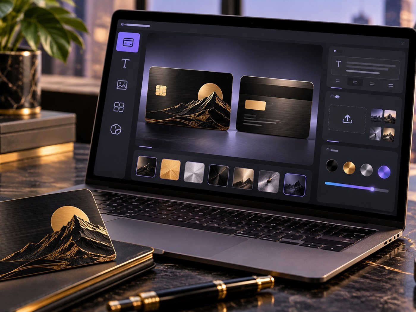
Use these tools to test spacing, check contrast, and prep supporting visuals before you place the final code in the card designer.
Helpful tools: Color Contrast Checker · Image Cropper · Image Resizer
4. Protect contrast and empty space
A QR code needs breathing room. Do not surround it with dense patterns, thin decorative lines, or similar tones. Even if the code looks stylish, poor contrast can reduce scan success.
This is one case where function should guide style. Keep the premium look, but do not sacrifice performance.
5. Test it before ordering
The final step is essential. Test the QR code with more than one phone if possible. Make sure the destination loads quickly and feels relevant.
If the QR code passes that test, it can become one of the most useful elements on the whole card. For more business-focused ideas, read our business metal card design ideas guide.
Frequently asked questions
Where should I place a QR code on a card?
A corner or lower section often works best because it leaves the main brand area clean while keeping the code easy to scan.
What should the QR code open to?
Use a destination that helps people act quickly, such as a contact card, website, portfolio, booking page, or social profile hub.
Can design choices make a QR code hard to scan?
Yes. Low contrast, tiny size, or crowding around the code can reduce scanning success.