
Front and Back Card Design Layout Ideas: How to Use Both Sides Without Making Them Busy
Using both sides of a custom metal card sounds easy, but many designs fail because each side tries to do the same job. When the front and back are given different roles, the card feels cleaner, stronger, and more premium.
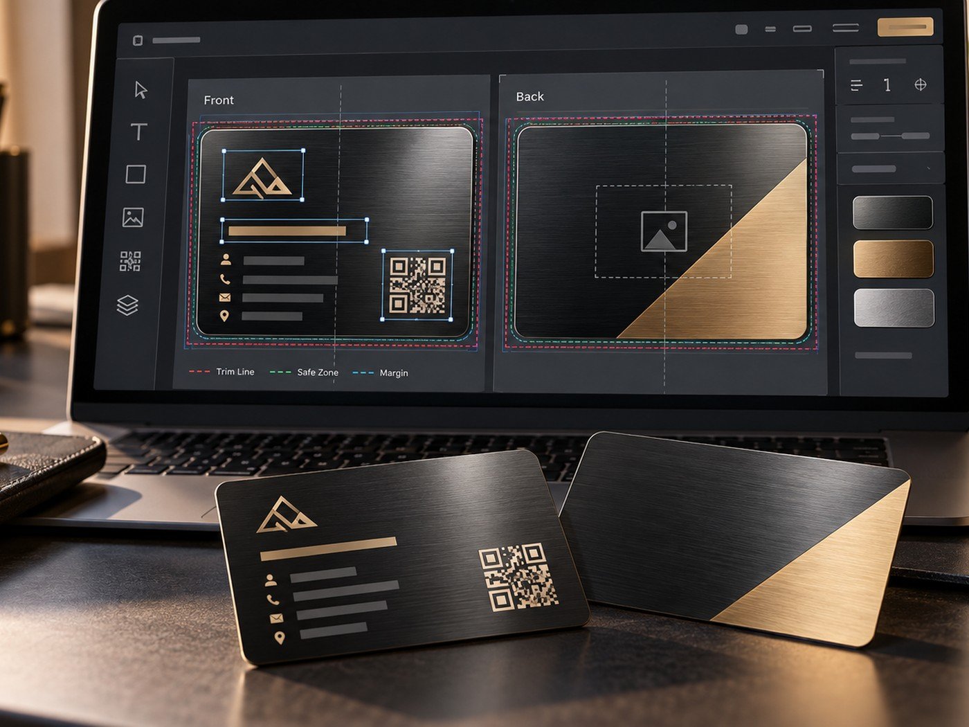
1. Give each side a clear role
The biggest layout mistake is repeating the same elements on both sides. If both sides carry a logo, name, title, phone number, email, and decorative pattern, the card quickly feels crowded.
A better system is simple. The front acts like the cover. The back acts like the support page. That approach makes the card easier to scan and easier to remember.
2. Strong front-side options
The front side usually works best when it carries one of these ideas: a logo with clean spacing, a monogram, a name with a premium finish, or a hero visual that fits the brand. Use fewer items, but make them stronger.
If your style leans luxury, you can use the front for a bold contrast between black and gold or a refined metal texture. If the goal is more personal, a monogram or initials can work better than a full information block.
| Front layout style | Works well for | Why it works |
|---|---|---|
| Logo + name | Brands and agencies | Clear identity with fast recognition. |
| Monogram or initials | Luxury or personal cards | Feels elegant and less crowded. |
| Hero image or engraving | Gift or keepsake cards | Creates emotion and memorability. |
| Minimal name only | Modern professional cards | Looks premium through restraint. |
3. Smart back-side options
The back is where utility often belongs. That utility may be contact details, a QR code, social handle, website, or a short supporting message. Some designs use the back only for texture or a continuation of the design language, and that can work too when the front already says enough.
A QR code can be especially useful on the back because it keeps the front cleaner. If you plan to use one, our guide on QR code placement on a metal business card will help.
Use support tools to clean up the layout
Before you import artwork, crop the image to the right composition and make sure your text stays short enough for the available space.
Helpful tools: Image Cropper · Word & Character Counter · Color Contrast Checker
4. Use safe spacing and margins
A premium card needs breathing room. Keep important text, icons, and QR codes away from the outer edge. This reduces the risk of awkward placement and makes the final design feel more expensive.
When you review the proof, zoom out and look at the overall balance. The best layout is not always the one with more information. It is the one with clearer visual order.
5. Test the balance before final approval
Look at the front and back together. Do they feel like the same card? Do the colors, finishes, and spacing belong to one system? A good front-and-back layout feels connected even when each side has a different role.
If you want more ideas, continue with our business metal card design ideas or our article on common custom card design mistakes.
Frequently asked questions
What goes best on the front of a metal card?
Usually the main identity goes on the front: a logo, name, monogram, or a hero visual with just enough detail to create a premium first impression.
Should I repeat the same design on both sides?
No. Repetition wastes space. Let one side attract attention and let the other side support the message.
Where should a QR code go?
A QR code usually works best on the back or in a corner where it stays easy to scan and does not compete with the main brand area.
2 Responses