
Best Text Ideas for Personalized Metal Cards: Names, Initials, Short Lines, and Elegant Details
Text is often the detail that decides whether a personalized metal card feels expensive or ordinary. The best designs do not say everything. They say the right things in the right amount.
1. Choose what the text must do
On a personalized card, text can identify a person, create a luxury feel, carry a message, or support contact details. That is why you should decide what the text is for before you write it.
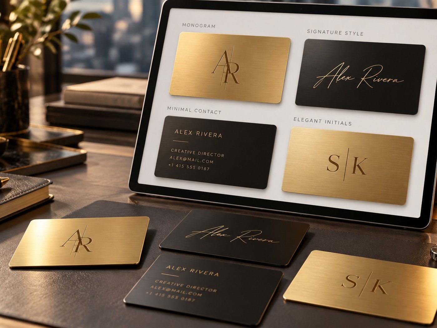
For example, initials work well when the card should feel exclusive. A full name works better when the card must be practical. A short line like “With Love” or “Creative Director” can support the main message without making the card heavy.
2. Best text ideas by style
| Use case | Text idea examples | Best format |
|---|---|---|
| Luxury personal style | Initials, monogram, surname | Large hero text |
| Signature look | Handwritten-style name | Front-side focal point |
| Professional networking | Full name, role, email, phone | Minimal contact block |
| Gift or keepsake | Short message, date, names | Simple emotional line |
The point is not to copy someone else. The point is to understand the structure. A card often looks best when it has one primary line, one secondary line, and then no more than a few supporting details.
3. Why less text looks more premium
Metal cards are small. When a small surface holds too many words, the design loses its calm. Premium design usually depends on spacing, restraint, and clarity. That is why short lines often win.
If you are unsure whether your text is too long, draft it first in the Word & Character Counter. It is a quick way to trim a line before you bring it into the designer.
Keep your wording clean before you style it
Use simple tools to shorten copy and make sure the final lines still fit the card gracefully.
Helpful tools: Word & Character Counter · Color Contrast Checker · Design Your Card
4. Edit the copy before you style it
Many people style weak wording instead of fixing the wording first. Start by removing anything people do not need immediately. If a card line can be shorter without losing meaning, shorten it.
This matters even more when using elegant scripts or minimalist sans-serif fonts. Decorative styling cannot rescue unclear wording. Better wording makes every font choice look stronger.
5. Pair text styles with purpose
A signature line often works best with a clean supporting font. A monogram works best when everything else is quiet. A contact block works best when the hierarchy is clear and the smallest lines remain readable.
You can combine this guide with our articles on colors and finishes and front and back layout ideas for a stronger result.
Frequently asked questions
How much text should I put on a metal card?
Keep it short. Most metal cards look better when they carry only the most useful details instead of full paragraphs.
Are initials better than a full name?
Initials work well for luxury or personal styles, while a full name works better when the card must identify you clearly.
Can I use a script signature font?
Yes, but use it with care. A signature style works best when it is the hero element and supporting details stay simple and readable.
One Response