
How to Choose Colors and Finishes for Custom Metal Cards That Still Look Readable
Great card colors do more than look nice. They shape mood, readability, and the premium feel of the finished piece. On metal cards, the finish matters just as much as the color because texture and reflection change how the design is seen.
1. Choose the mood first
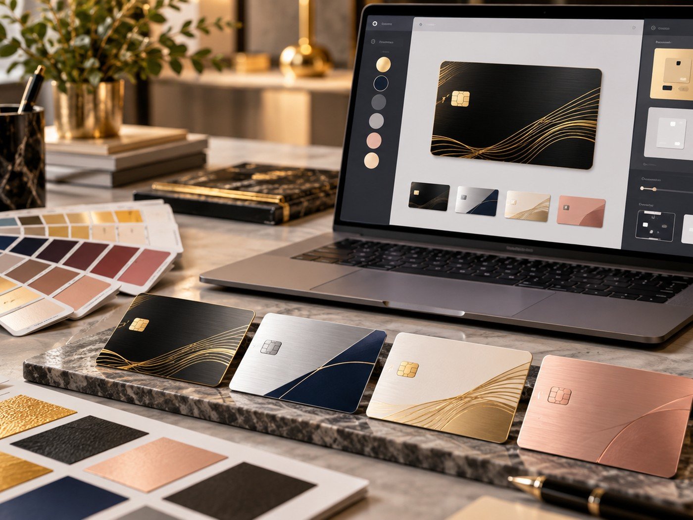
Color should support the feeling you want the card to create. Black and gold often feel bold and luxurious. Silver and navy feel modern and precise. White and gold feel soft and elegant. Rose tones can feel personal and warm.
The mistake is choosing color by trend alone. A premium service card, a creative portfolio card, and a wedding keepsake may all need different moods even if they all look expensive.
2. Match the color with the finish
A brushed finish softens the look and adds texture. A darker matte surface can make gold or light text stand out. A bright metallic tone can feel clean, but it may need stronger contrast to stay readable.
This is why the same layout can feel very different in gold, black, silver, or rose-metal finishes. The finish is not a small detail. It changes the entire character of the card.
| Color/finish idea | Mood | Best use |
|---|---|---|
| Black + gold brushed | Bold and luxury | Founders, consultants, premium services |
| Silver + navy | Modern and corporate | Professional networking |
| Ivory/white + gold | Soft and elegant | Gift cards and events |
| Rose-gold neutral | Warm and personal | Boutique brands and keepsakes |
3. Test contrast before approval
One of the most common problems with premium-looking cards is weak contrast. The card may look beautiful in a mockup but disappointing in real use because the text blends into the surface.
Use the Image Color Palette Extractor to pull color ideas from a photo or brand visual, then test those combinations with the Color Contrast Checker. This is one of the easiest ways to avoid low-contrast mistakes.
Build your palette with more confidence
Pull ideas from a source image, test contrast, and create a supporting gradient or background if you need matching visuals for related content.
Helpful tools: Image Color Palette Extractor · Color Contrast Checker · Gradient Background Generator
4. Reliable premium combinations
There is no single best combination, but some color systems are easier to work with. High-contrast systems are safer. Limited palettes are cleaner. One accent color usually works better than several competing tones.
If you like a darker card, the Midnight Signature Metal Card style direction can be a good visual reference. If you prefer a lighter premium direction, the Golden Monogram Metal Card offers another path.
5. What to avoid
Avoid using too many metallic tones in one design. Avoid pale text on reflective pale surfaces. Avoid putting decorative texture behind important small details. Premium design usually comes from clarity, not from excess.
For more practical help, read our guides on preparing artwork and common custom card mistakes.
Frequently asked questions
What colors look premium on metal cards?
Black and gold, silver and navy, white and gold, or rose-gold neutrals are common premium combinations because they feel refined and easy to style.
Should I always choose a dark card?
Not always. A dark card feels bold, but a light card can look clean and elegant when contrast is handled well.
Why does contrast matter so much?
Because a beautiful low-contrast card may look impressive at first glance but fail when someone tries to read small details.
2 Responses