Canva Pinterest Pin Design Tips for More Clicks, Saves and Clearer Graphics
Pinterest is a visual discovery platform, so a pin needs to communicate quickly. The image should help a person understand the topic before they open the page. A clear headline, strong image, and simple layout usually work better than a crowded collage.
Canva templates can speed up production, but the first step is still the message. Decide what the pin promises and who it is for. Then choose a layout that supports that promise.
- Choose a vertical format.
- Write a useful headline.
- Use one strong visual promise.
- Design for feed size.
- Create reusable pin variations.
1. Start With the Right Vertical Shape
Use a vertical canvas made for Pinterest. A tall pin gets more usable space in the feed than a square graphic. Check the current size guidance before you create a full series.
The social media size guide explains common ratios, and the image resizer can help prepare source photos before you place them into a template.
| Element | Keep | Avoid |
|---|---|---|
| Headline | Large and clear | Tiny multi-line copy |
| Photo | One focal image | Many unrelated images |
| Brand | Small consistent cue | Large logo that takes over |
| CTA | Optional and short | Several competing actions |
2. Write a Headline That Matches the Page
The headline should describe what the click will deliver. Use plain words that match the article, product, or guide behind the pin. This makes the creative more useful and reduces the gap between the graphic and the destination.
Keep the wording short enough to read in the feed. If the idea needs a full sentence, move extra detail into the pin description or landing page.
3. Give the Pin One Strong Visual Promise
Choose one visual direction. You can use a product image, a finished design, a before-and-after, or a simple lifestyle scene. The image should support the headline rather than act as decoration.
Use the Pinterest Canva templates to study vertical composition. Notice how useful layouts reserve clear areas for text instead of placing words over busy details.
Make the image and headline work together
- Show the result when possible.
- Crop close to the main subject.
- Keep busy backgrounds behind simple text cards.
- Use consistent color treatment across a series.
4. Preview the Pin at Feed Size
Zoom out before export. The main words should still be readable. Small script fonts, thin lines, and weak contrast can disappear on a phone.
Test solid text and background pairs with the contrast checker. For text placed over a photo, add a solid card or overlay if the image changes too much behind the words.
5. Build Variations From One Strong Template
Create a small family of layouts instead of redesigning each pin from zero. Keep the same type scale and margins, then vary the photo, headline, and accent block.
This makes batch creation faster and helps your pins look connected. It also lets you test creative ideas without changing every design rule at once.
Fast real-world test
Do a fast phone test. Put the pin on screen at a small size. Read it once. The first line should be clear at once. The main photo should still make sense. If you must zoom, cut words or make the type larger. Keep the call to action short. Let the pin do one job well.
Show the pin to one other person for five seconds. Ask what they think it is about. If the answer is wrong, fix the hook or the main image. This quick test can catch more problems than adding more design effects.
How to Create Better Pinterest Pins in Canva
Video source: YouTube
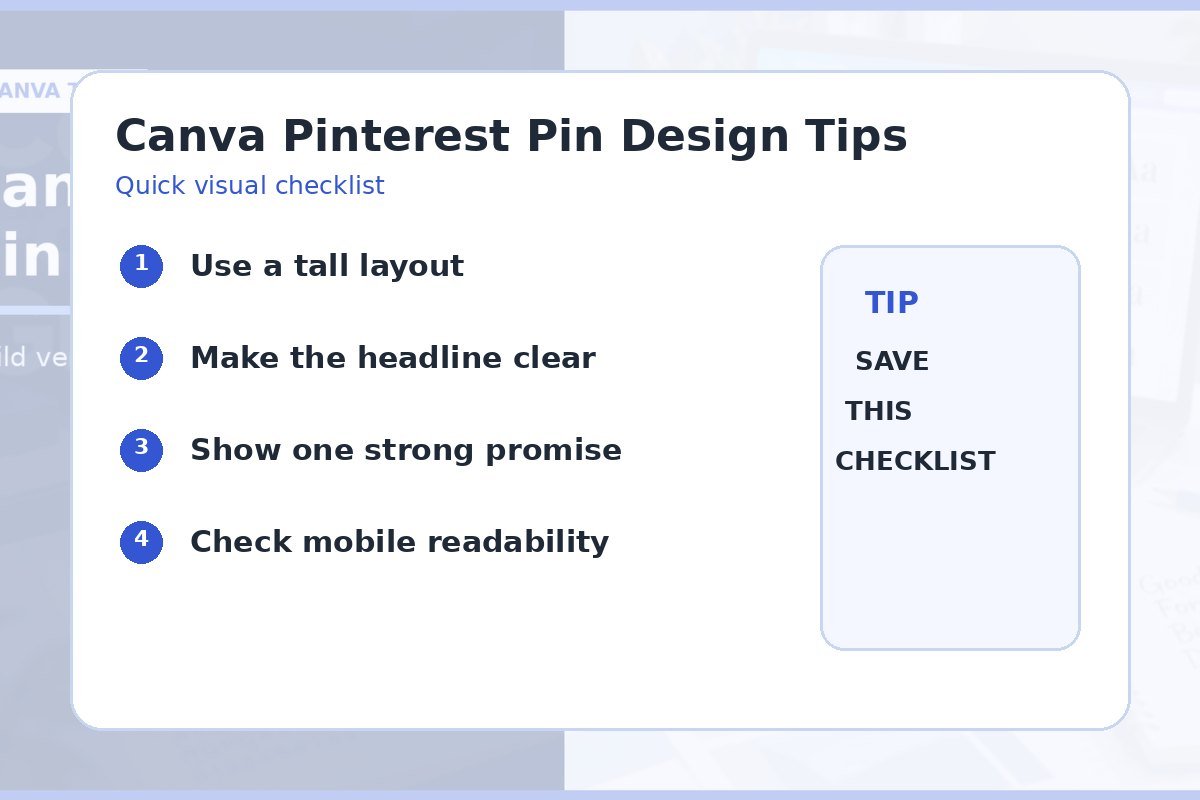
Quick checklist
- Vertical canvas.
- Headline matches destination.
- One focal image.
- Readable at feed size.
- Strong text contrast.
- Reusable layout system.
Frequently asked questions
What makes a good Pinterest pin in Canva?
A good pin has a clear vertical layout, useful headline, strong visual focus, readable text, and a destination that matches the promise.
Should I put a logo on every pin?
A small consistent brand cue can help, but it should not compete with the headline or visual.
Can I reuse the same Pinterest layout?
Yes. Reuse the structure, then change the image, headline, and small accents. This keeps the brand consistent and saves time.