How to Make a Professional Logo in Canva Without Looking Generic
A logo does not need many effects to look professional. It needs a clear idea, a readable shape, and a form that still works when it becomes very small. Canva can help you explore type, symbols, and layouts, but the strongest result usually comes from using fewer elements.
Think of the logo as one part of a brand system. It should work on a website header, a social profile, a document, and a small icon without needing a different design every time.
- Define the logo job.
- Start with a simple concept.
- Choose type and colors carefully.
- Test one-color and small versions.
- Export the right master files.
1. Define What the Logo Must Do
Write down the brand name, the feeling you want, and the places where the logo will appear. A local service business may need a clear wordmark. A creator may need a simple monogram for profile images.
Avoid starting with effects. Start with the name and one idea. Browse the Canva logo template collection for structure, but change the concept enough to make the result fit the brand.
Useful logo formats to plan
| Format | Best use |
|---|---|
| Wordmark | Website header and documents |
| Symbol | Small icon and avatar |
| Combination | Flexible everyday use |
| Monogram | Short initials or compact marks |
2. Build the Mark With Simple Shapes
Simple geometry is easier to recognize and easier to scale. Use one shape idea, then remove anything that does not add meaning. Thin detail often disappears when the mark is used as a small profile image.
Check the silhouette. If the mark becomes a blur when you shrink it, simplify the shape or open the spacing.
3. Use Type as Part of the Logo, Not an Afterthought
Choose a font that matches the brand tone and is still readable. Adjust spacing around letters before adding more decoration. A clean wordmark can feel more unique through proportion and spacing than through a complex font.
Use the rules in the Canva font pairing guide when the logo will sit next to a broader heading and body font system.
4. Keep the Color System Small
A logo should also work in one color. Test a black version and a white version before you rely on gradients or multiple accents. This helps on invoices, stamps, simple print, and dark backgrounds.
Use the contrast checker when the mark includes text on a solid background. For brand colors, build a small palette rather than changing the logo color in every design.
5. Export With Future Uses in Mind
Keep the editable Canva project as the master. Export a transparent PNG when you need a raster logo on different backgrounds. Keep a high-quality version for future use.
If you need to convert an exported raster image between PNG, JPG, and WebP, use the image converter. Read the Canva export guide for format choices before you create a full brand asset folder.
Fast real-world test
Print the mark in black on plain white paper, or view it as a tiny icon. The name should still be easy to read. The shape should still feel clear. If fine lines vanish, make them thicker or take them out. If two parts merge, add more space.
Now place the mark on a dark block, a light page, and a small round profile crop. A good logo does not need a new fix for each place. Keep the core mark plain and strong, then let the rest of the brand add style.
How to Make a Logo in Canva
Video source: YouTube
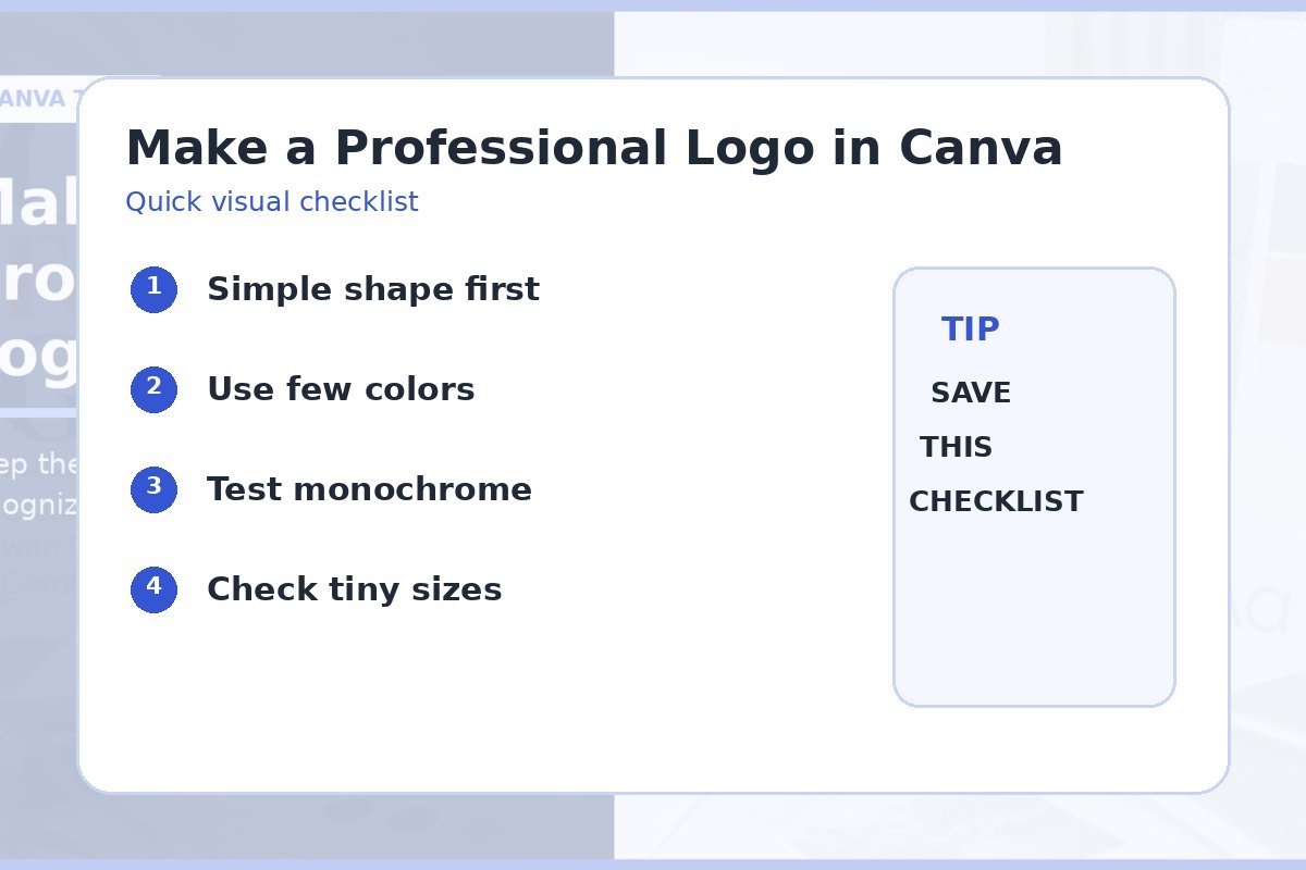
Quick checklist
- One clear concept.
- Simple silhouette.
- Readable wordmark.
- Works in one color.
- Looks clear when small.
- Master and delivery files saved.
Frequently asked questions
Can I make a professional logo in Canva?
Yes, especially for simple wordmarks and combination marks. The quality depends more on the concept, spacing, and consistency than on adding many effects.
How many colors should a logo use?
One or two main colors are enough for many logos. Make sure a one-color version also works.
Should I use a Canva logo template as-is?
Treat templates as a starting point. Change the type, spacing, shapes, and color system so the result fits your own brand.