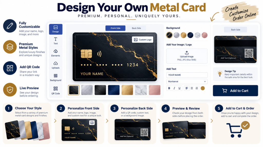
Business Metal Card Design Ideas That Look Premium Without Looking Overdone
A business metal card has one job: create a memorable first impression without losing clarity. It should not feel like a novelty. It should feel like a premium extension of the brand behind it.
1. Match the design to the industry
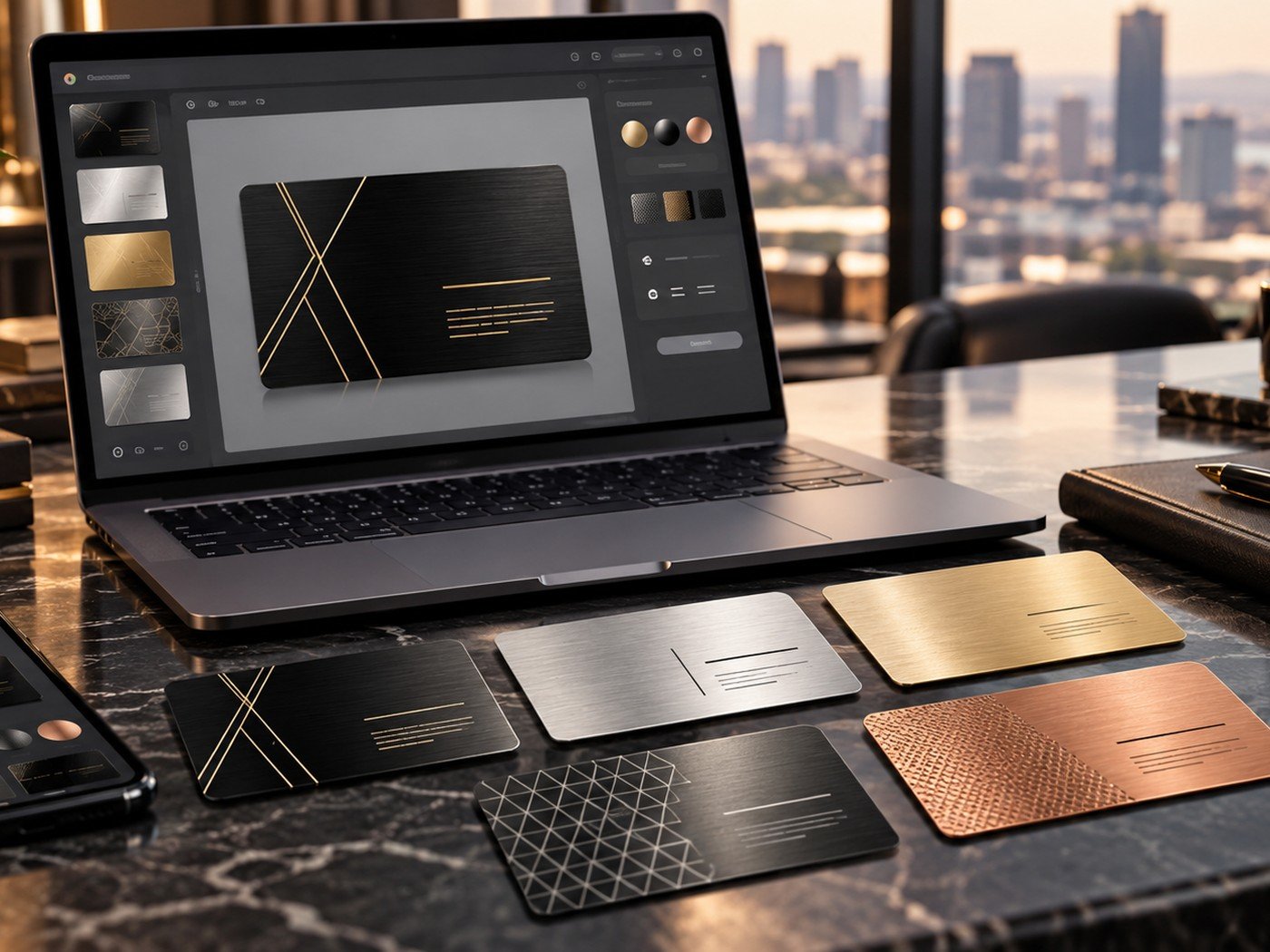
A designer, lawyer, realtor, agency owner, and beauty brand should not all use the same tone. The card can still feel premium in every case, but the personality should shift with the industry.
That is why concept boards help. One card may rely on strong geometry and minimal text. Another may rely on softer neutrals and a subtle pattern. The important thing is brand fit, not decoration for its own sake.
| Business type | Good direction | Recommended content |
|---|---|---|
| Consultants and coaches | Minimal and clear | Name, role, email, phone |
| Creative agencies | Stylish with one bold detail | Logo, role, portfolio or QR code |
| Real estate and services | Trustworthy and practical | Name, contact options, QR code |
| Boutique beauty or fashion | Elegant and visual | Brand mark, name, short contact block |
2. Popular premium styles
Black with gold accents remains a strong business style because it feels assertive and upscale. Silver with one dark accent feels more corporate. A textured dark pattern can work well when it stays subtle and does not disrupt readability.
Our article on colors and finishes can help if you are still deciding which direction fits your brand.
3. Keep networking needs in mind
A business card is not only a visual object. It is a tool people use quickly. That means the most useful information should be easy to find. If someone has to search for your phone number or website, the design has already become less effective.
For many brands, a short contact block on one side and a cleaner brand side on the other is the right balance.
Useful support tools for business card prep
Use these tools when you want cleaner visuals, lighter image files, or a quick way to improve supporting brand assets before you import them into the card designer.
Helpful tools: Image Compressor · PNG, JPG & WebP Converter · Text Watermark Tool
4. When a QR code helps
A QR code helps when you want to connect the physical card to a digital action. It can open a contact card, website, booking link, portfolio, or profile hub. The QR code should make the card easier to use, not harder to look at.
If you plan to add one, read the full guide on QR codes on metal business cards.
5. Find the right balance between wow and usefulness
A strong business metal card stands out, but it also stays useful. The goal is not just to impress someone for a moment. The goal is to make them remember you and contact you easily later.
If you want a practical review process before ordering, use our custom metal card order checklist.
Frequently asked questions
Which business style works best for metal cards?
Minimal and confident styles usually work best because they feel professional and stay readable in real use.
Should I place my full address on the card?
Only if it is truly useful. In many cases a phone number, email, website, or QR code is enough.
Can a metal card work for service businesses?
Yes. Service brands can use a metal card to stand out, especially when the card is clean, trustworthy, and clearly branded.