
Canva Font Pairing Guide: 12 Easy Rules for Cleaner Designs
Good font pairing is less about finding two “perfect” fonts and more about giving each font a clear job. A strong Canva design usually needs a display style for the main message and a calm style for supporting text. When both fonts fight for attention, the layout feels busy even when the rest of the design is clean.
This guide gives you a simple system you can reuse for social posts, pins, presentations, flyers, and brand graphics. If you are also building a full visual system, read the personal branding with Canva templates guide after you set your typography rules.
- Start with a clear type job.
- Choose a safe font pair.
- Build hierarchy with size and weight.
- Check spacing and mobile readability.
- Save a repeatable type system.
1. Give Every Font a Clear Job
Start by deciding what the reader should notice first. Use one font for the main headline and one for supporting text. You can still use bold, regular, and italic styles from the same family. This creates variety without adding noise.
A useful test is to hide the images and look at the words alone. The headline should still feel like the first stop. The body copy should feel quiet and easy to read. If every line has the same visual weight, the design has no clear path.
A simple three-level type scale
| Text role | Purpose | Style |
|---|---|---|
| Headline | Main idea | Bold or display |
| Support | Adds context | Medium weight |
| Body | Details | Regular, simple |
2. Pair Contrast, Not Conflict
A serif heading can work well with a clean sans serif body. A heavy geometric heading can pair with a softer regular body. The key is visible contrast. Two fonts that look almost the same can feel like a mistake rather than a choice.
Avoid pairing two highly decorative fonts. They compete for attention and can make short text hard to scan. When one font has a strong personality, let the other font stay neutral.
- Use one expressive font at most.
- Keep paragraph text simple.
- Check numbers and punctuation, not just letters.
- Use the same pair across a campaign when possible.
3. Build Hierarchy With Size Before Adding More Fonts
Font size and weight can solve most hierarchy problems. Make the headline larger, reduce the size of support text, and keep body copy comfortable. You do not need a third font just because a subheading needs more emphasis.
The Word & Character Counter is useful when a headline keeps wrapping. Shorter copy often improves the layout more than shrinking the type.
Keep the headline short enough to breathe
- Aim for one clear message.
- Break long lines at natural phrases.
- Avoid very tight line spacing.
- Leave space around the text block.
4. Test the Design at the Size People Will See It
A font pair that looks elegant on a large desktop canvas may fail on a phone. Zoom out until the design is close to feed size. Check thin strokes, small labels, and low-contrast text. If a caption becomes hard to read, increase its size or choose a simpler style.
Use the Social Media Size & Image Resizer when you need to prepare supporting images for different placements. Then compare the final graphic at square, portrait, and vertical sizes before you publish.
Do not rely on zoomed-in editing views
5. Save a Small Type System
Once a pair works, write down the font names, weights, sizes, and common uses. This turns a good one-off design into a repeatable system. Your next post will start with a decision already made.
Keep two or three approved headline treatments rather than a large menu of options. Consistency makes a brand easier to recognize and makes your own workflow faster. For layout support, use the Canva layout and alignment tips to keep type blocks lined up with images and cards.
How to Change Font Pairings in Canva
Video source: YouTube
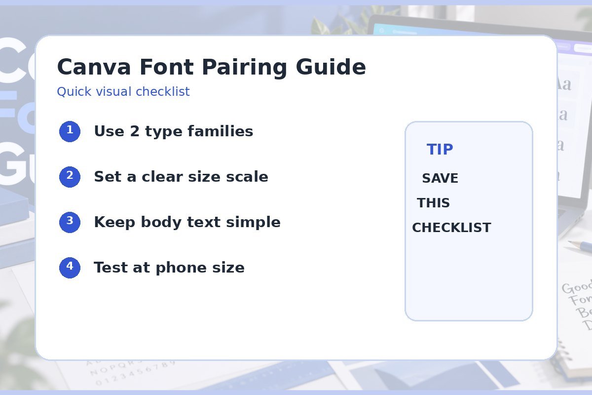
Quick checklist
- One main headline font.
- One calm body font.
- Clear size difference between levels.
- Readable line spacing.
- Strong text and background contrast.
- Tested at phone size.
Frequently asked questions
How many fonts should I use in one Canva design?
Two font families are enough for most designs. You can create more variety with size, weight, and spacing.
Should headings and body text use the same font?
They can. One family with a bold heading and regular body style can look very clean. A contrasting pair is useful when you want more personality.
What is the easiest font pairing rule for beginners?
Choose one strong headline style and one simple body style. Make sure the difference is clear and keep the same pair across related graphics.