
Canva Layout and Alignment Tips: Use Grids, Frames and Spacing Like a Designer
Many Canva designs look “almost right” because the colors and images are fine but the spacing is inconsistent. Alignment and layout are the invisible structure that makes a design feel professional.
This guide focuses on practical composition: shared edges, grids, frames, grouping, and repeatable spacing. Combine it with the broader Canva design tips for beginners if you are building your design system from scratch.
Helpful Tool: Preview Layouts at the Right Size
Spacing and alignment decisions look different at different sizes. Use this tool to preview or resize your design so your layout still feels balanced on the final platform.
- Check how layouts behave in square, vertical, and wide canvases.
- Resize supporting images for cleaner spacing.
- Prevent layout problems before publishing.
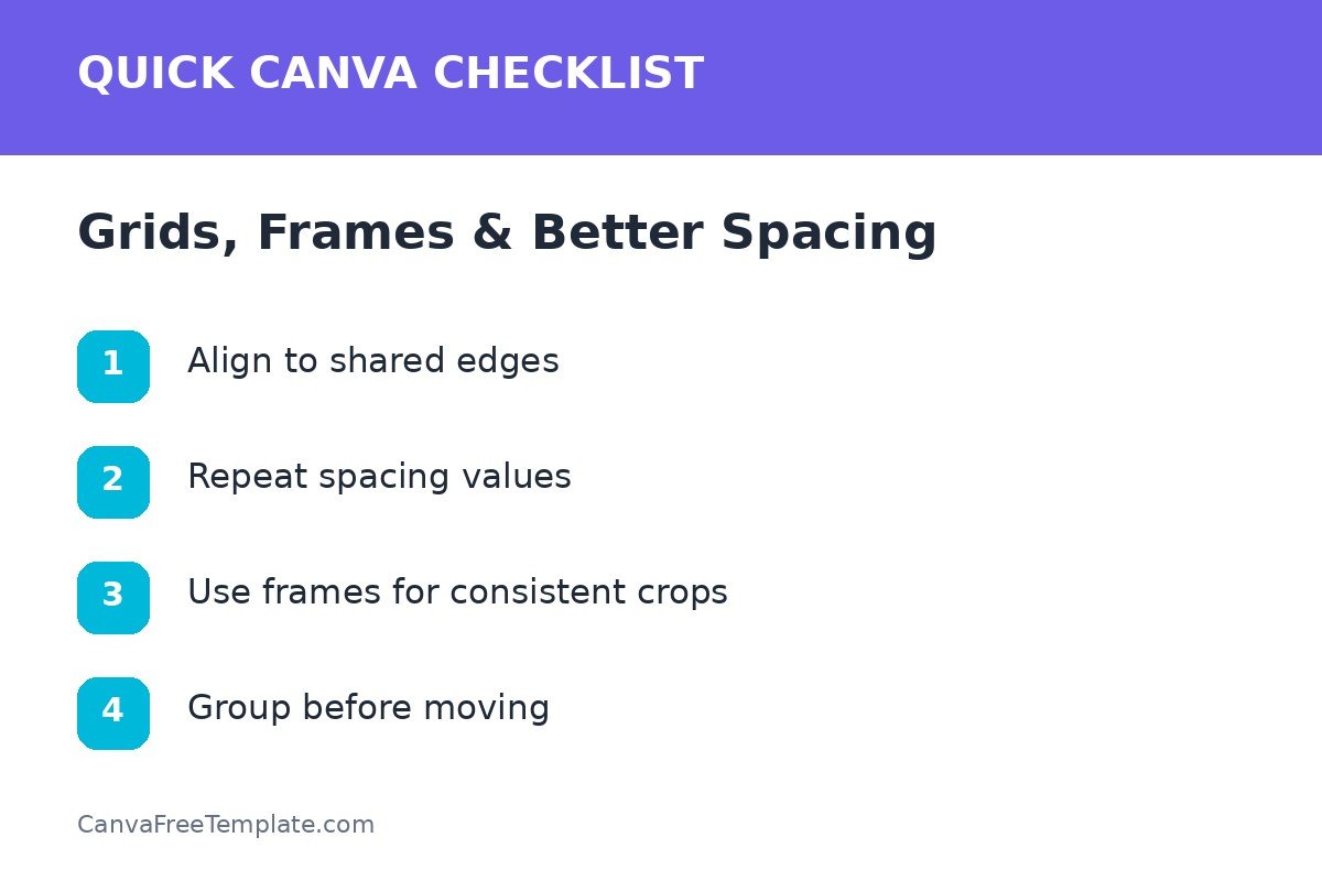
1. Align Elements to Shared Edges
Random placement makes the viewer work harder. Pick a left edge, center line, or grid boundary and align related elements to it. Headings, paragraphs, buttons, and image cards feel more connected when they share structure.
Good alignment habits
- Align multi-line text to a common left edge.
- Use consistent card widths.
- Match button edges with nearby content blocks.
- Keep section labels in the same position across a series.
2. Create a Small Spacing Scale
Instead of eyeballing every gap, choose three spacing levels: tight, normal, and section. Use tight spacing between a heading and its subline, normal spacing between separate items, and larger spacing between content groups.
| Spacing level | Use between | Visual meaning |
|---|---|---|
| Tight | Label + headline | These belong together |
| Normal | Text + image or list items | Separate but related |
| Section | Major content groups | New idea begins |
3. Use Canva Grids and Frames for Image Consistency
Frames are especially useful when you want photos to have the same shape. This prevents a collage from feeling messy because every crop follows a consistent container.
Useful frame applications
- Product cards
- Team members
- Before-and-after comparisons
- Portfolio screenshots
- Instagram carousel examples
Study the image structures in the site’s Instagram templates and Facebook templates to see how repeated frames can create visual rhythm.
4. Group Related Elements Before Moving Them
A card might contain an icon, headline, paragraph, and button. Once spacing is correct, group the pieces before moving or duplicating the card. This protects the internal relationships and reduces accidental misalignment.
Group by meaning
Do not group everything simply because it is close together. Group elements that function as one unit, then align the group with other units.
5. Balance the Composition With Negative Space
Negative space is not wasted space. It gives the focal point room to work. If one side of the design feels heavy, do not automatically add decoration to the empty side. Instead, adjust scale, position, or cropping until the composition feels intentional.
Quick balance test
Use the blur test
Squint at the design or zoom out. You should still see a clear dominant area and a stable distribution of visual weight. If every corner is equally busy, simplify.
Layout Checklist
- Shared alignment edges
- Consistent outer margins
- Repeatable spacing scale
- Frames for repeated image shapes
- Grouped content units
- Enough negative space
- Strong visual focal point
Once your structure is consistent, styling becomes easier. Apply the same layout logic across the Canva templates you use so your content looks connected even when the topic changes.
FAQs About Canva Layout and Alignment
How do I make elements line up in Canva?
Use Canva’s alignment guides and position tools, then verify that related objects share common edges or centers. Consistent spacing between items matters just as much as alignment.
When should I use Canva frames?
Frames are useful when multiple images need consistent shapes or crops, such as team grids, product cards, portfolios, and social media collages.
What is the easiest way to improve spacing in Canva?
Choose a small spacing scale and reuse it. For example, use one gap for tightly related items, a larger gap between groups, and consistent outer margins.
Should every element be centered?
No. Center alignment can work for simple compositions, but left-aligned text and shared edges often create stronger structure in information-heavy layouts.

4 Responses