
Canva Presentation Design Tips: Create Cleaner Slides With Less Clutter
A good presentation helps the audience follow the idea. It does not try to place the full script on every slide. The best Canva slide decks use strong hierarchy, simple layouts, and enough space for the main point to stand out.
Start with the story before you choose a template. Write the key sections and the single message for each slide. Then use design to make that path easier to follow.
- Plan the story first.
- Use one main idea per slide.
- Create a repeatable grid.
- Make text easy to read.
- Use charts and images with purpose.
1. Plan the Slide Story Before Styling
List the opening, key points, proof, example, and final action. Give each slide one job. This reduces clutter and helps you choose the right visual for each point.
A simple outline also stops you from changing the layout every time you reach a new idea. You can reuse a small set of slide types instead.
Useful slide types
| Slide type | Purpose |
|---|---|
| Title | Set the topic |
| Point | Explain one idea |
| Data | Show one useful number or chart |
| Example | Show the idea in context |
| Summary | Repeat the key takeaway |
2. Use One Main Idea Per Slide
If a slide needs several paragraphs, split it. Large type and short text are easier to follow in a room and on a shared screen. Keep speaker details in notes rather than forcing them into the design.
Use a short headline that states the point. Then add one image, chart, or short list that supports it.
3. Build a Repeatable Grid
Choose consistent outer margins and align text blocks to shared edges. Repeat the same heading position across related slides. This makes the deck feel calm even when the images change.
Use the layout and alignment guide for spacing rules, grids, and negative space. The same system works well for presentation cards and social graphics.
- Shared left edge for titles.
- Consistent slide margins.
- Repeatable image sizes.
- Limited card styles.
- Same footer or page number position.
4. Make Text Large Enough to Read
A presentation is not a document page. Use larger type than you would use in a blog article or handout. Keep lines short and avoid light gray body text on white.
Test the key colors with the contrast checker. If the deck will be shown on a projector, choose even stronger contrast because the image may look washed out.
5. Use Charts and Images Only When They Add Meaning
A chart should answer a question. A photo should support the point. Decorative visuals can make a slide feel busy without making the message clearer.
When an image has the wrong crop, prepare it with the Image Cropper before you place it into a repeated frame. This helps a whole deck look more consistent.
How to Make a Presentation in Canva
Video source: YouTube
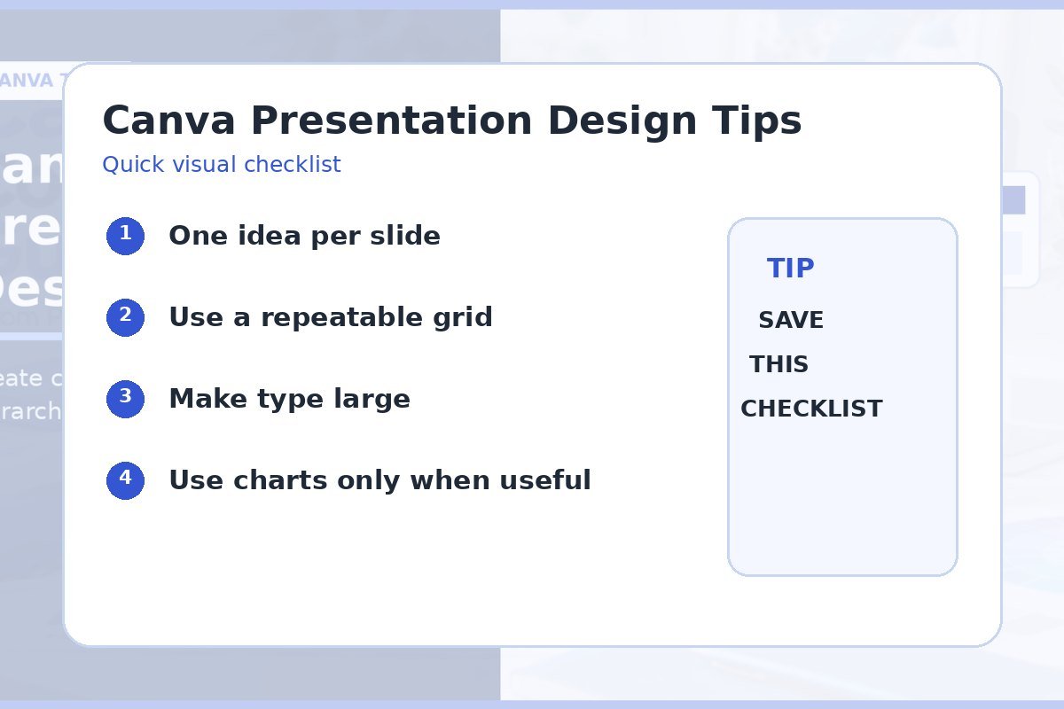
Quick checklist
- Story outline complete.
- One idea per slide.
- Shared grid and margins.
- Large readable type.
- Charts have a clear point.
- Final deck tested on target screen.
Frequently asked questions
How much text should be on a Canva presentation slide?
Use only the text the audience needs to understand the point. Move long explanations to notes or a separate document.
Should every slide use the same layout?
Use a small set of related layouts. Repetition helps, but you can vary image and data slides while keeping the same grid and type system.
What is the easiest way to improve a crowded slide?
Remove secondary information, enlarge the main point, and give the remaining content more space.