Canva YouTube Thumbnail Design: Make Thumbnails Clear at a Small Size
A YouTube thumbnail has one job: help the viewer understand what the video is about before they click. It does not need to explain the whole video. It needs one clear subject, one message, and enough contrast to work on a phone.
Canva gives you templates and effects, but those tools are most useful when the idea is already simple. Start with the video promise, then build the visual around it.
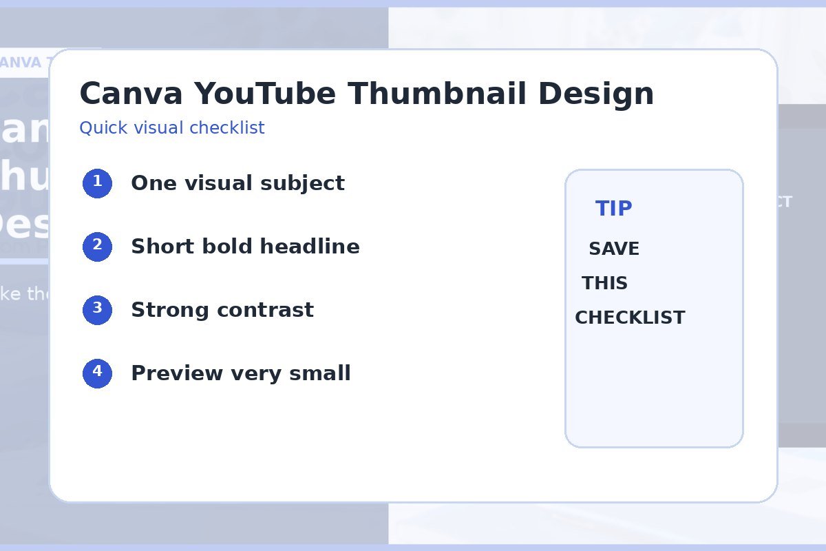
- Choose one main subject.
- Keep on-image text short.
- Use contrast and separation.
- Check safe spacing.
- Preview the final thumbnail small.
1. Choose One Main Visual Subject
Pick the face, product, screenshot, or object that carries the idea. Make it large enough to recognize. A thumbnail with five equal subjects gives the eye no clear starting point.
If you use a photo, crop it around the main subject. The Image Cropper can help prepare an image before you place it into the final design.
One focal point beats a crowded collage
- Use one main face or object.
- Remove weak background detail.
- Leave room for the headline.
- Keep supporting icons small.
2. Keep Thumbnail Text Short
Use text only when it adds information the image cannot carry alone. A short phrase is easier to read at small size. Avoid repeating the full video title word for word.
Try two or three headline options. The Word & Character Counter helps you compare shorter versions before you start shrinking the font.
| Better choice | Why it works |
|---|---|
| 3–6 strong words | Readable in a small preview |
| One key number | Creates a quick detail |
| Short contrast phrase | Adds a clear angle |
| No text when image is enough | Keeps the image clean |
3. Separate the Subject From the Background
Use contrast in brightness, color, or shape. A dark subject on a dark background can disappear. A pale headline over a bright photo can do the same.
You can add a soft outline, shadow, or solid color block when needed. Keep the effect simple. Test the main text and solid background pairs with the Color Contrast Checker.
4. Keep Important Elements Away From the Edges
Give the subject and headline breathing room. Avoid placing small text or key details near the corners. Interface elements and different previews can make edge content harder to notice.
Use a repeatable grid so every thumbnail has a familiar structure. The layout and alignment guide can help you build consistent margins and shared edges.
5. Preview It at a Small Size Before Export
Zoom out until the thumbnail looks close to a real recommendation card. Can you still identify the subject and read the main words? If not, simplify the design.
Export a test and open it outside the editor. For file type choices, use the Canva export format guide before uploading the final image.
How to Make YouTube Thumbnails in Canva
Video source: YouTube
Quick checklist
- One main subject.
- Short optional headline.
- Strong visual separation.
- Comfortable edge spacing.
- Recognizable at small size.
- Final export checked.
Frequently asked questions
How much text should I put on a YouTube thumbnail?
Use as little as the idea needs. A short phrase is easier to read than a sentence.
Should the thumbnail repeat the video title?
It can share the same promise, but it does not need to repeat every word. Let the thumbnail and title add useful context together.
What is the best way to test a thumbnail?
View it very small. If the subject and main message are still clear, the design is doing its job.