You can usually tell when a design was made in Canva.
Not because Canva is the problem—but because thousands of people choose a template, replace the text, change one color, and publish it.
The result is technically finished, but it still looks like a template.
Professional Canva design works differently.
It uses strong hierarchy, intentional spacing, consistent typography, better image choices, restrained colors, and layouts that guide the viewer toward one clear action.
That means you do not need Photoshop, an expensive designer, or years of graphic-design experience to make polished content. Canva currently provides thousands of customizable templates across social graphics, presentations, business designs, brochures, carousels, and other formats. (Canva)
You simply need better ideas—and a better system for customizing them.
Here are 35 Canva design ideas that look professional, not basic, including practical layouts you can recreate for your business, personal brand, clients, Pinterest account, social media, or portfolio.

What Makes a Canva Design Look Professional?
Before opening another template, understand one important principle:
Professional design is usually simpler than amateur design.
Beginners often try to improve a graphic by adding another shape, font, shadow, icon, gradient, sticker, or decorative element.
Experienced designers usually ask:
What can I remove?
A strong design has one clear message, one visual focal point, intentional white space, consistent alignment, readable typography, controlled colors, and enough contrast to make the important content obvious.
Canva itself provides editable layouts across thousands of professional and minimalist template styles, but those templates work best when you customize their colors, imagery, text, and layout around your own visual identity. (Canva)
Use the following ideas as structures, not designs you need to copy exactly.
Professional Social Media Canva Design Ideas
1. Create a Bold Typography Instagram Post
Start with the simplest possible formula:
One strong headline.
One small supporting sentence.
One tiny brand element.
Skip the stock-photo background and let typography become the design.
For example, instead of writing:
5 Ways to Improve Your Marketing
try:
Your Marketing Isn’t the Problem. Your Message Is.
Place the main statement in large bold type and highlight only one or two important words using your accent color.
The key is contrast.
If the headline is large, supporting copy should be noticeably smaller.
If one word is bright, the other words should remain neutral.
This makes the design feel intentional instead of noisy.
You can find suitable starting layouts inside Canva’s professional social-media template collection. Browse Canva Social Graphic Templates
2. Design a Minimal Quote Post That Does Not Look Generic
Most quote graphics fail because they use centered text, script fonts, quotation marks, and a random background image.
Try an editorial layout instead.
Place your quote in the lower-left corner.
Use a large serif font.
Add the person’s name in tiny uppercase text.
Leave 30–40% of the design completely empty.
A little empty space can make an ordinary sentence feel much more important.
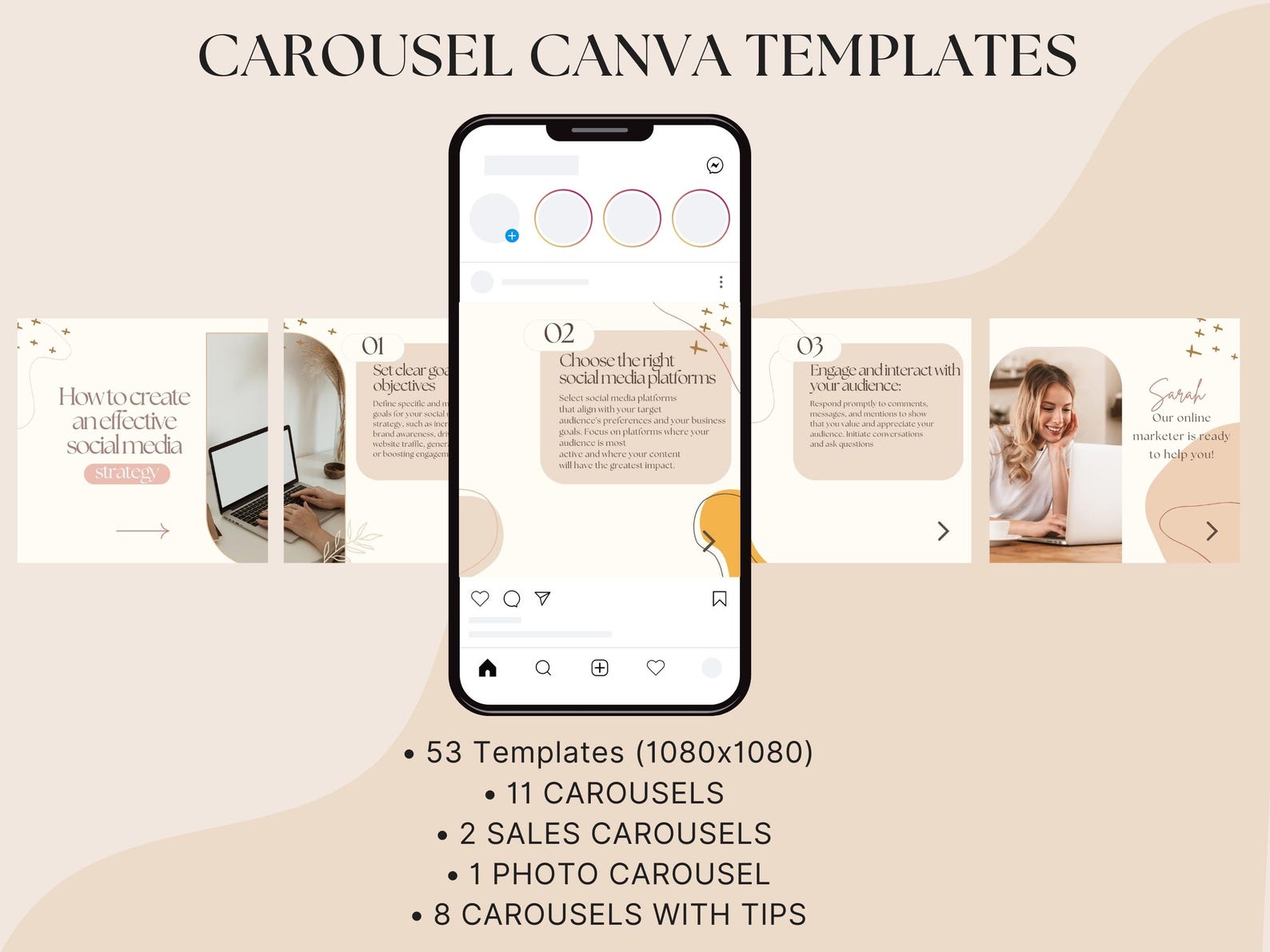
3. Build a Seamless Instagram Carousel
Carousels become much more memorable when every slide feels connected.
Instead of designing ten separate cards, create one large visual concept.
A line can travel from slide to slide.
An oversized word can continue across two panels.
A product photo can appear partially cropped at the right edge and continue on the next card.
Canva has thousands of editable carousel layouts, so you can start with the structure rather than designing every slide from nothing. (Canva)
Explore Canva Carousel Templates
4. Make an Educational “One Big Number” Graphic
Data becomes easier to understand when you stop showing too much of it.
Instead of presenting seven statistics at once, make the number itself the hero.
For example:
73%
could occupy almost half of your design.
Underneath:
of customers research a business online before contacting it.
Then add one small source line.
This layout works especially well for consultants, agencies, coaches, financial brands, marketers, and educational accounts.
5. Turn a Checklist Into a Premium Graphic
A checklist does not need boxes floating everywhere.
Use a strong headline at the top.
Create a simple vertical line.
Place five checklist items down one side.
Use subtle check icons rather than giant illustrated ticks.
Highlight only the most important item in your accent color.
The result feels closer to an editorial infographic than a worksheet.
6. Design a “Problem vs Solution” Split Layout
Divide the design into two clear halves.
The left side represents the problem.
The right side represents the desired outcome.
For example:
Basic Website
Slow
Confusing
Generic
No CTA
versus
Conversion Website
Fast
Clear
Branded
Lead Focused
The contrast itself creates the visual hierarchy.
You can adapt many of Canva’s business infographic templates for this style. Browse Canva Business Templates
7. Create a Before-and-After Transformation Design
Transformation content naturally creates curiosity.
Use one image on the left and the improved version on the right.
Keep both images the same size.
Use tiny labels such as:
Before
and
After
Avoid covering the images with paragraphs.
If the transformation is strong, it should do most of the selling for you.
This format is powerful for websites, logos, rooms, products, fitness, photography, makeup, branding, landscaping, and design services.
Canva Branding Design Ideas
8. Build a Clean Brand Board
A brand board is one of the easiest designs to make look expensive.
Include your logo, alternate logo, color palette, typography, image direction, and a few graphic elements.
The trick is spacing.
Do not force everything into tiny boxes.
Let important elements breathe.
Use one neutral background and let your palette become the visual interest.
Canva’s minimalist and professional collections provide excellent structures for this type of layout. Explore Canva Minimalist Templates
9. Create a Visual Color-Palette Card
Instead of posting five circles with HEX codes underneath them, turn your palette into a mini brand world.
Use one large lifestyle image.
Place your colors beside it in different-sized blocks.
Add two fonts.
Include a short brand description such as:
Modern. Warm. Confident.
The result gives viewers context for how the colors actually work together.
10. Design a Logo Presentation Mockup
A logo alone rarely feels impressive.
Presentation creates perceived value.
Display the logo on a light background first.
Then show it on a dark background.
Add a close-up of the icon.
Finish with one realistic mockup—a package, storefront, mobile screen, business card, or shopping bag.
The logo has not changed.
Its perceived quality has.
11. Build a Mini Brand Guidelines Page
Show your primary logo, spacing rules, typography, colors, button styles, image direction, and correct/incorrect logo use.
Keep the information highly visual.
This is especially useful if you design for clients because it transforms a logo delivery into a complete identity system.
Canva has professional presentation structures that can easily be adapted into brand-guideline decks. (Canva)
Browse Professional Canva Presentation Templates
12. Create a Signature Pattern
Take one element from your logo—a line, letter, icon, curve, dot, or shape—and repeat it into a pattern.
Reduce its opacity.
Use it behind packaging, Instagram Stories, business cards, cover images, and presentation dividers.
A recurring secondary element can make your brand recognizable even when the logo is small.
Business Canva Design Ideas
13. Design a High-End Service Menu
Avoid a grid containing twelve icons and twelve paragraphs.
Feature three or four main services instead.
Give each service a number:
01 Website Design
02 Local SEO
03 Paid Advertising
Add one short benefit underneath each.
The numbering itself gives the design structure.
14. Create a Premium Pricing Guide
Pricing graphics often look cheap because they resemble spreadsheets.
Instead, present packages like products.
Give each package a clear name.
For example:
Starter
Growth
Authority
Keep the feature list concise and visually highlight your recommended plan.
Use spacing rather than thick borders to separate plans.
15. Build a Modern Business Proposal
A proposal should sell before your prospect starts reading every detail.
Start with an impressive cover.
Then follow a logical sequence:
The problem.
The opportunity.
Your approach.
Deliverables.
Timeline.
Investment.
Next step.
Professional presentation layouts from Canva can give you a strong foundation without making the proposal feel like a school presentation. (Canva)
Explore Professional Presentation Templates
16. Design a One-Page Company Profile
Create one page that quickly communicates who you are.
Use a large company statement at the top.
Underneath, include a short About section, three core services, one proof statistic, one testimonial, and contact information.
Imagine someone spending only 10 seconds on it.
What must they remember?
Make those elements visually dominant.
17. Create a Professional Business Flyer
Forget the traditional layout filled with giant phone numbers, multiple images, starbursts, and oversized SALE graphics.
Use one strong photo.
One persuasive headline.
Three short benefits.
One CTA.
Canva has a huge collection of business formats that can be simplified into cleaner promotional pieces. (Canva)
18. Design a Minimal Business Card
Your business card does not need your entire story.
Front:
Logo.
Back:
Name.
Role.
Phone.
Website.
That may be enough.
Premium business cards often feel expensive precisely because they do less.
Content Marketing Canva Design Ideas
19. Turn a Blog Post Into a Visual Carousel
Do not promote a blog post using only its featured image.
Extract its strongest five ideas.
Turn each point into a carousel slide.
Then use the last slide to say:
Want the full breakdown? Read the complete guide.
You are giving value before asking for a click.
That makes the CTA much more persuasive.
20. Create a “Save This” Cheat Sheet
Useful content earns saves.
Take one process and compress it into a single graphic.
Examples:
Website Launch Checklist
7-Step SEO Audit
Brand Color Formula
Client Onboarding Checklist
Instagram Content Framework
Make the title large and organize the remaining information into clearly separated zones.
Avoid tiny text.
A cheat sheet is useless if users need to zoom in three times to read it.
21. Design a Flowchart
Some concepts become much easier when viewers can visually follow a path.
For example:
Search → Website → Trust → Contact → Sale
or
Idea → Design → Review → Publish → Measure
Use arrows sparingly.
Keep the shapes consistent.
Highlight only the most important stage.
22. Create a Timeline Graphic
Timelines are perfect for showing processes, company histories, project phases, launches, and case studies.
Instead of a straight horizontal line with ten tiny labels, create four or five large milestones.
For example:
Week 1 — Strategy
Week 2 — Design
Week 3 — Development
Week 4 — Launch
Clarity beats completeness.
23. Create a Data-Driven Infographic
Combine data with storytelling.
Start with one powerful statistic at the top.
Follow it with three supporting insights.
Finish with one conclusion.
Avoid turning an infographic into a database.
Your reader should know what the data means—not simply see the numbers.
Canva’s business library includes multiple professional infographic formats that can be customized for this purpose. (Canva)
Find Canva Business Infographic Templates
24. Turn FAQs Into Visual Content
Every question customers repeatedly ask is a content opportunity.
Use the question as the main headline:
“How long does a website take?”
Then place the short answer beneath it.
Use the caption or blog post for deeper explanation.
This makes your social media useful while quietly overcoming sales objections.
Canva Presentation Design Ideas
25. Build an Editorial Presentation
Not every slide needs:
Title.
Paragraph.
Image.
Footer.
Mix the pacing.
One slide might contain one sentence.
Another might feature a full-screen photograph.
Another might contain three statistics.
Another can use a simple diagram.
Changing the rhythm keeps attention without making the deck look inconsistent.
Canva’s current professional presentation library includes minimalist pitch decks, project presentations, creative briefs, company presentations, and brand-guideline styles. (Canva)
26. Create an Oversized-Number Slide
When showing results, let the result dominate the slide.
Instead of writing:
“During our campaign we achieved a 214% increase in traffic.”
Design:
+214%
in enormous type.
Then underneath:
Organic Traffic Growth
The audience should understand the achievement before you finish explaining it.
27. Design a Case Study Presentation
A compelling case study tells a transformation story.
Structure it around:
Challenge → Strategy → Execution → Result
Show evidence.
Use screenshots.
Use before-and-after visuals.
Show measurable results whenever possible.
Avoid spending six slides explaining your company before showing what you actually accomplished.
28. Create an Agency Pitch Deck
Your pitch deck should not begin with:
About Us
Start with your prospect.
For example:
Your competitors are already winning the searches your customers make every day.
Now they have a reason to continue reading.
Later, introduce your services as the bridge between the problem and the desired outcome.
Canva’s social-media presentation collection includes strategy, proposal, report, portfolio, and marketing-plan layouts that can be adapted for agency pitches. (Canva)
Browse Canva Social Media Presentation Templates
Pinterest Canva Design Ideas
29. Create a High-Contrast Pinterest Pin
Pinterest users scroll quickly.
Your Pin should communicate the topic before someone reads every word.
Use a large headline occupying around one-third of the design.
Then add one strong image.
Keep the remaining elements minimal.
Compare:
“Some Great Design Tips for People Who Use Canva”
with:
“17 Canva Tricks That Make Designs Look Expensive”
The second creates specificity and curiosity.
30. Create a Magazine-Cover Pinterest Pin
Use an editorial photograph and large typography similar to a magazine cover.
Place the headline partially over the photograph while preserving strong contrast.
Add one tiny category label at the top.
For example:
CANVA DESIGN
Then the main headline:
35 Layout Ideas Worth Stealing
The structure feels less like a typical Pinterest template and more like editorial content.
31. Create a Pinterest Collage Pin
Use three carefully chosen images.
One large image occupies about 60% of the design.
Two smaller images support it.
Place the headline inside a solid-color block rather than directly over a busy photograph.
This works extremely well for food, fashion, interior design, travel, crafts, templates, beauty, weddings, and visual inspiration articles.
Creative Canva Design Ideas That Stand Out
32. Use the “Broken Grid” Layout
Not every element needs to remain perfectly inside an invisible box.
Allow one image to overlap a text area.
Let an oversized number slightly leave the canvas.
Place a small label partly over a photo.
These controlled breaks make layouts feel more editorial and custom.
The important word is controlled.
Random misalignment looks like a mistake.
Intentional asymmetry looks like design.
33. Create a Paper-Cut Editorial Layout
Use photographs with backgrounds removed.
Place them over simple geometric blocks or subtle paper textures.
Add a small shadow to create depth.
Use only two or three layers.
This gives your design a tactile feel without becoming a scrapbook full of unrelated stickers.
34. Design With an Oversized Word in the Background
Take one keyword and make it enormous.
For a branding post:
BRAND
For an SEO post:
FOUND
For a design post:
CREATE
Lower its contrast and place the primary message over or around it.
The oversized word becomes a composition element rather than just text.
This simple technique can make even a basic layout feel custom.
35. Turn One Design Into a Complete Visual System
This is the idea that separates random Canva users from people who build strong brands.
Stop designing isolated graphics.
Create a system.
Suppose your core layout uses a cream background, black typography, orange accent, thin black border, small uppercase category label, and large serif headline.
Now adapt that system into an Instagram post, carousel, Pinterest Pin, presentation cover, business card, proposal, flyer, brochure, and testimonial graphic.
Everything looks different.
Yet everything feels connected.
That is branding.
And that is when Canva starts producing work that no longer feels like “just another Canva template.”
How to Make Any Canva Template Look Less Like a Template
Finding a beautiful Canva template is only the beginning.
Canva’s template library allows users to modify elements such as colors, fonts, imagery, and layouts, so use that freedom instead of simply replacing the placeholder copy. (Canva)
Change the Typography First
Template typography is one of the easiest ways other people recognize the original design.
Replace it.
Choose one headline font and one readable supporting font.
Then build a clear size hierarchy.
Your headline should not be only two pixels larger than your paragraph.
Make the difference obvious.
Replace Every Stock Image
Photography has enormous influence on perceived quality.
Avoid using whatever image came with the template.
Choose images that fit one visual direction.
If your brand feels modern and bold, use modern and bold photography.
If it feels calm and premium, choose soft, controlled images.
Consistency matters more than finding the “perfect” picture.
Remove 20% of the Elements
Look at the finished template.
Now ask:
What can disappear without hurting the message?
Remove a decorative line.
Delete an unnecessary icon.
Reduce the shadow.
Remove a shape.
Shorten the copy.
Professionalization often happens through subtraction.
Control Your Color Palette
Do not keep six colors simply because the template includes six.
Try:
One main background.
One text color.
One accent color.
Maybe one secondary neutral.
This alone can dramatically improve the design.
Fix Alignment and Spacing
Use equal gaps.
Align text edges.
Keep margins consistent.
Allow more space above major headings than between related lines of copy.
These tiny details are not exciting, but they are usually what separates polished design from amateur design.
The Canva Template Collections Worth Saving
Instead of searching Canva from zero every time you need content, bookmark a few strong collections.
For polished client or corporate work, start with Canva’s professional templates. Professional Canva Templates
For clean layouts with more breathing room, use the minimalist collection. Minimalist Canva Templates
For client proposals, company profiles, infographics, marketing materials, and general commercial designs, browse business templates. Business Canva Templates
For Instagram educational content and swipe posts, explore carousel templates. Instagram Carousel Templates
For polished decks, reports, case studies, pitches, and strategy presentations, use professional presentation templates. Professional Presentation Templates
For brochures and printable marketing material, Canva also has a dedicated brochure collection. (Canva) Canva Brochure Templates
Your Next Canva Design Should Not Start With a Template
It should start with a goal.
Ask yourself:
What should someone notice first?
What should they understand second?
What should they do next?
Then choose a Canva template that supports that journey.
Not the other way around.
A beautiful template cannot save a weak message.
But a strong message combined with good hierarchy, controlled typography, consistent colors, intentional spacing, and the right imagery can turn even a simple Canva layout into something that feels professionally art-directed.
And that is the real difference between using Canva and designing with Canva.
You do not need to master all 35 ideas today.
Choose three.
Create one visual system.
Build a post.
Turn it into a carousel.
Adapt it into a Pinterest Pin.
Turn the same concept into a presentation cover.
Repeat the design language instead of reinventing your brand every time.
That is how you stop producing graphics that look basic—and start producing Canva designs people save, remember, trust, and act on.