
Canva Instagram Carousel Design: Plan, Design and Split Better Swipe Posts
A good Instagram carousel feels like a short visual story. Slide one earns the swipe. The middle slides deliver the value. The last slide gives the reader a simple next step. Canva makes the design part easy, but the structure still matters.
Before you open a template, write the slide sequence in plain text. This keeps the design focused and stops you from forcing too much copy into each panel.
- Write the carousel outline first.
- Design slide one as a clear hook.
- Use one idea per slide.
- Create visual flow.
- Export and split cleanly.
1. Write the Slide Plan Before You Design
Start with a short outline. A useful pattern is hook, problem, two or three teaching points, example, and action. Not every carousel needs ten slides. Use only the number of panels the idea needs.
Keep each slide focused on one thought. If one panel needs a paragraph and five bullets, split it into two slides. The Word & Character Counter can help you tighten copy before you design.
Simple carousel structure
| Slide | Job | Copy goal |
|---|---|---|
| 1 | Hook | Short promise or problem |
| 2–5 | Teach | One point per slide |
| Next | Example | Show the idea |
| Last | Action | Save, read, visit, or reply |
2. Design Slide One for a Small Screen
Your cover should still make sense when it is small in the feed. Use one strong headline and one visual anchor. Avoid tiny labels, long subtitles, and many decorative items.
Use a 4:5 portrait canvas when that format fits your content plan. Check the current placement size in the social media size guide before you build a large batch.
- Keep the main words large.
- Use strong text contrast.
- Leave safe space around the edges.
- Do not hide the main idea inside a photo.
3. Create Visual Rhythm Across the Slides
Repeat the same title position, margins, colors, and type scale. Then vary one part of the layout, such as the image crop or card position. This gives the carousel movement without making every slide look unrelated.
Use small cues such as a page number, progress line, or arrow when they support the reading path. Keep them subtle. The message should still be the main visual element.
Use a repeatable grid
- Same outer margins.
- Same heading style.
- Same card radius.
- Same image treatment.
- One accent pattern.
4. Build Seamless Effects Only When They Help
A continuous image can encourage swiping, but it is not required. If you create one wide design, keep important text away from panel boundaries. A face, product, or word can look broken if it is cut between slides.
The Carousel Image Splitter can divide a prepared wide image into equal panels. Check every exported slide before posting, especially the first and last panel.
5. Finish With One Clear Action
The last slide should not ask for five actions. Choose the next step that matches the post. You might ask the reader to save the guide, visit a related article, or view a template collection.
If the carousel supports a broader campaign, keep the final slide consistent with your Instagram Canva templates and other branded posts.
How to Create an Instagram Carousel Post With Canva
Video source: YouTube
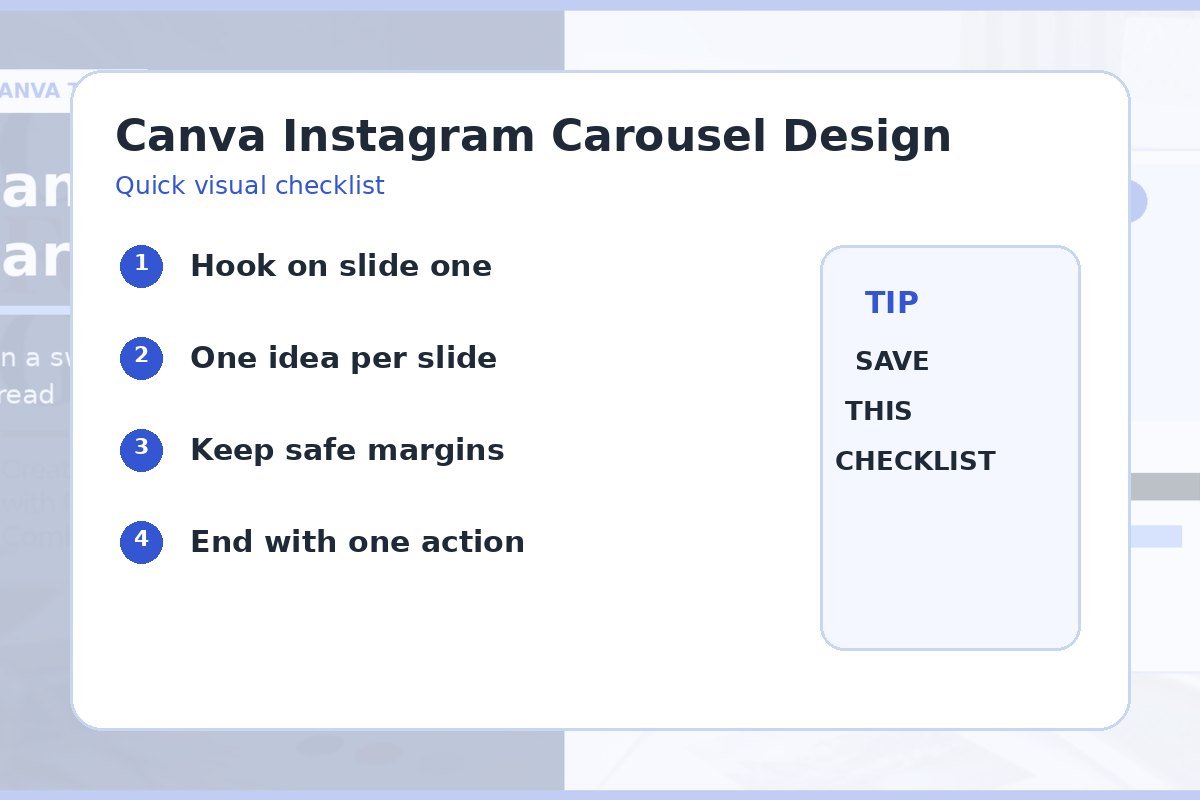
Quick checklist
- Clear first-slide hook.
- One idea per slide.
- Repeatable type and spacing.
- Important content away from edges.
- Panels checked after export.
- One action on the final slide.
Frequently asked questions
How many slides should an Instagram carousel have?
Use the number needed to explain the idea clearly. A short six-slide guide can be stronger than a padded ten-slide post.
Should every carousel be seamless?
No. A consistent visual system is enough. Seamless effects are useful only when they improve the reading flow.
How do I keep carousel text readable?
Use larger type, short lines, clear contrast, and generous margins. Preview each slide at phone size before export.