A logo can take five minutes to recognize—and months or years to forget.
That is why choosing a random symbol, typing your business name underneath it, and calling it finished usually does not create a brand people remember.
The good news is that you do not need to begin with a blank canvas.
Canva currently offers thousands of editable business, minimalist, monogram, letter, aesthetic, and industry-specific logo templates. You can change typography, colors, illustrations, and other elements to adapt a starting design to your own brand. (Canva)
The key is knowing which logo direction fits your business and how to customize the template enough that it no longer feels generic.
This guide gives you 30 Canva logo design ideas you can customize in minutes, from clean wordmarks and monograms to beauty, real-estate, café, fashion, creative-agency, and modern business logos.
Why the Best Canva Logos Usually Look Simple
A common beginner mistake is trying to make a logo prove everything about the business at once.
A coffee business gets a coffee cup, beans, steam, mountains, leaves, a slogan, a circle, and three different fonts.
A marketing company gets an arrow, chart, rocket, laptop, globe, gradient, and lightning bolt.
The logo becomes descriptive—but difficult to remember.
A stronger approach is to choose one memorable idea.
That idea could be your company name, initials, a geometric symbol, a small illustration, an elegant typeface, or an unusual arrangement of letters.
Before choosing one of the 30 ideas below, ask yourself three questions:
What should my brand feel like?
Modern? Premium? Friendly? Bold? Creative? Natural? Traditional?
Where will my logo appear most often?
Website header? Instagram profile? Product packaging? Storefront? Business cards?
What should someone remember?
Your name? Your initials? Your symbol? Your industry?
Once those answers are clear, finding the right Canva template becomes much easier.
Minimal Canva Logo Design Ideas
1. Use a Clean Black-and-White Wordmark
Sometimes the strongest logo is simply the company name presented beautifully.
Skip icons entirely.
Choose a strong typeface, adjust the letter spacing, and use black against white.
This approach works especially well for fashion brands, design studios, photographers, consultants, agencies, architecture businesses, and personal brands.
The biggest advantage is flexibility. A clean wordmark works on websites, invoices, social profiles, packaging, and printed material without needing complicated adjustments.
To make it feel custom, experiment with one unusual letter, slightly increased spacing, or a subtle font-weight contrast.
A good Canva starting point is the Black and White Minimalist Branding Logo.
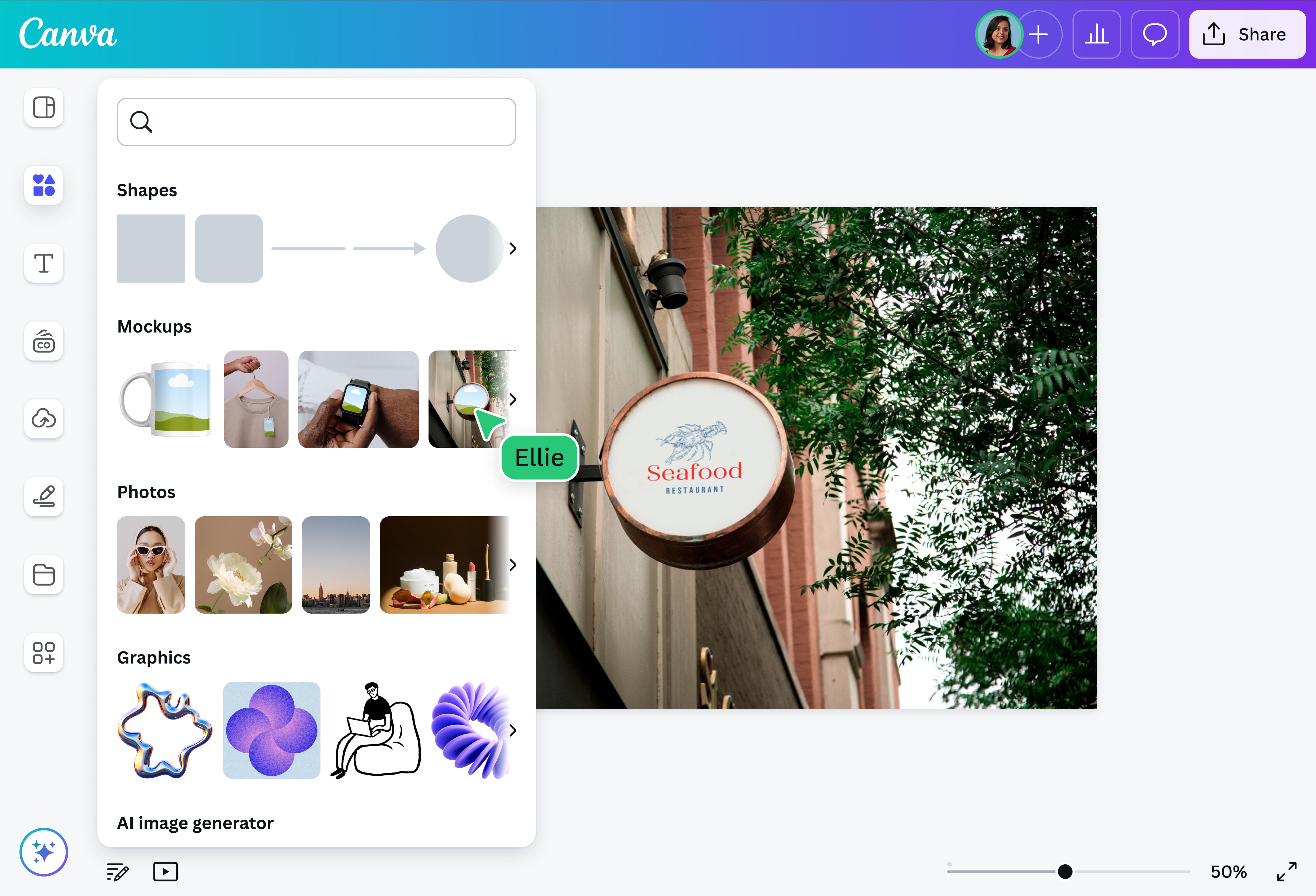
Customize the Black and White Minimalist Branding Logo
2. Build a Minimal Initial Logo
If your company name is long, turn the first letter into the identity.
For example, a brand called Northfield Interiors could build around a stylized N.
The secret is to avoid decorating the letter excessively.
Use one strong typeface and perhaps one line, curve, cut, or geometric treatment.
Initial logos are particularly useful because the symbol can later become your favicon, Instagram profile image, packaging stamp, watermark, or mobile app icon.
Canva has an editable Black and White Minimalist Professional Initial Logo that provides a clean starting structure.
Use the Minimalist Professional Initial Logo template
3. Combine Two Initials Into a Monogram
Two-letter monograms instantly create a more established feel when handled carefully.
Imagine:
RS
MK
NW
Instead of simply placing the letters next to each other, overlap them, connect one stroke, or make one letter sit inside the other.
This works especially well for luxury businesses, real estate, weddings, photography, personal brands, salons, consultants, and fashion labels.
Canva’s monogram collection includes thousands of variations. (Canva)
Try this specific design:
Customize the Black and White Minimalist Initials Monogram Logo
4. Try a Geometric Monogram
If a traditional monogram feels too formal, combine your initials using circles, squares, angled lines, or other geometric forms.
This can give the logo a more modern and technology-focused personality.
A geometric monogram works particularly well for software companies, creative studios, architecture firms, marketing agencies, SaaS products, and modern professional services.
Canva has a strong ready-made starting point:
Open the Typographic Geometric Monogram Professional Modern Logo
5. Create a Lowercase Wordmark
Uppercase text often feels confident.
Lowercase text often feels approachable.
That makes lowercase wordmarks useful for lifestyle brands, skincare companies, creative studios, cafés, wellness businesses, apps, and modern consumer products.
Try using a simple lowercase brand name with plenty of spacing around it.
Avoid adding an icon unless it genuinely contributes something.
The simplicity is what makes the design feel intentional.
Browse Canva Minimalist Logo Templates
6. Use Wide Letter Spacing for a Luxury Look
Take a short brand name and increase the space between each letter.
For example:
A U R A
rather than:
AURA
Pair the name with a small secondary line such as:
INTERIORS
STUDIO
LONDON
EST. 2026
The contrast between a widely spaced main name and a tiny secondary line can immediately make the logo feel more editorial.
This works beautifully for salons, boutiques, fashion brands, jewelry stores, interior designers, photographers, wedding businesses, and premium service companies.
7. Build a Logo Around One Typographic Detail
You do not always need an entirely unusual font.
Take a normal wordmark and customize one character.
Perhaps the crossbar of an A extends farther.
Maybe an O becomes a circle symbol.
Perhaps two letters connect.
Maybe a dot becomes your brand color.
One deliberate detail can create far more memorability than adding another illustration.
Canva’s typographic business templates provide useful foundations for this technique. Canva’s business-logo library currently includes minimalist, typographic, modern, creative-agency, studio, fashion, and company styles. (Canva)
8. Use a Thin Serif Logo
Thin serif typography can give a logo an editorial, refined appearance.
It works well for wedding businesses, fashion, jewelry, photography, interior design, beauty, lifestyle products, and premium personal brands.
Keep the typography large enough to remain readable.
Very thin fonts can look beautiful at large size but disappear when used as tiny social-media icons.
So create a secondary simplified mark as well.
9. Create a Bold Sans-Serif Wordmark
Luxury is not the only professional direction.
Sometimes you need power.
A thick geometric sans-serif font can work brilliantly for fitness brands, creative agencies, streetwear companies, construction businesses, technology firms, media brands, and startups.
Try using the name in bold black typography with one small unexpected detail.
Canva’s Black White Bold Minimal Creative Agency Logo is a useful example of that direction.
Customize the Bold Minimal Creative Agency Logo
10. Create a Black-and-Gold Minimal Logo
Black and gold can work when used with restraint.
The mistake is making every part of the design gold.
Instead, use black as your primary visual color and reserve gold for one small accent, icon, line, or letter.
For beauty, florists, salons, jewelry brands, event businesses, and premium products, this can produce a sophisticated result quickly.
Try:
Customize Canva’s Black and Gold Minimalist Flower Logo
Canva Logo Ideas Using Symbols and Shapes
11. Put the Brand Name Inside a Circle
Circular logos are extremely flexible.
They work as Instagram profile images, stickers, packaging labels, stamps, badges, and product marks.
Place the brand name around the outside and use one simple symbol or initial in the center.
Do not fill every available area.
A circle already creates a strong boundary, so the internal elements can remain simple.
12. Turn a Letter Into an Abstract Symbol
Take the first letter of your brand name and simplify it until it becomes almost icon-like.
An M could become mountains.
An A could become an upward arrow.
An S could become a flowing path.
A C could become a circular motion symbol.
The best versions work at two levels: viewers can see a symbol first and discover the letter second.
Canva provides a dedicated collection of editable letter-logo templates. (Canva)
Browse Canva Letter Logo Templates
13. Use a Simple Line-Art Icon
Line-art logos work beautifully for businesses where elegance matters more than visual aggression.
Consider a single-line flower, face, building, leaf, hand, cup, arch, or abstract shape.
Pair it with simple typography.
The icon should support the business name rather than overpower it.
This direction works particularly well for florists, skincare brands, handmade businesses, wellness companies, beauty services, cafés, and interior studios.
14. Build an Arch Logo
Arches are useful because they naturally frame typography.
Place your company name below or inside a simple arch.
Add one tiny element beneath it.
This format works particularly well for architecture, cafés, home décor, construction, handmade products, wellness, photography, and lifestyle brands.
Keep the arch clean rather than filling it with complex illustrations.
15. Use Negative Space
Negative-space logos use the empty area between objects as part of the design.
For example, two shapes might form a hidden initial when placed together.
This is harder to build than a plain wordmark, but even a simple version can make a logo feel more thoughtful.
In Canva, begin with basic geometric elements rather than searching for one complicated finished icon.
Arrange simple shapes until the empty area creates something meaningful.
Canva Logo Ideas for Personal and Service Brands

16. Create a Personal Brand Monogram
If the business revolves around you—consulting, coaching, development, design, photography, content creation, freelancing—a monogram can be more useful than an industry icon.
Use your initials prominently.
Place your full name underneath.
Then add a tiny descriptor such as:
WEB DEVELOPER
CONSULTANT
PHOTOGRAPHER
DESIGNER
This creates a flexible identity that can grow with you even if your exact service changes later.
Explore Canva Monogram Logo Templates
17. Design a Digital Marketing Logo Without a Rocket Icon
Marketing logos often repeat the same symbols: rockets, arrows, charts, megaphones, and targets.
You can stand out simply by not using them.
Try an abstract letter mark, clean typographic logo, or geometric symbol instead.
Then let your colors communicate energy.
Canva has a useful modern starting template:
Customize the Modern Digital Marketing Consultant Logo
18. Create a Real-Estate Monogram
Real-estate businesses frequently use houses and roof icons.
There is nothing inherently wrong with that, but it makes differentiation difficult.
Instead, combine the initials of the agency with subtle architectural geometry.
Use straight lines, a premium serif, or a minimal frame.
Canva’s Black and White Minimalist Monogram Real Estate Logo is a strong example to customize.
Use the Minimalist Monogram Real Estate Logo
19. Create an Ultra-Minimal Real-Estate Wordmark
If the company already has a strong name, you might not need a house symbol at all.
Try:
HARRINGTON
with:
PROPERTIES
in smaller typography below.
That can feel more premium than a complex illustration.
Canva also has a straightforward minimalist real-estate template:
Customize the Black and White Minimalist Real Estate Logo
20. Build a Creative Studio Logo
Creative businesses have more freedom to break traditional logo rules.
Use bold type.
Crop a letter.
Rotate a small word.
Add an unusual underline.
Split your company name over two lines.
A creative logo should still remain readable, but it does not need to look conservative.
For inspiration, Canva’s graphic-designer collection includes monograms, typographic logos, studio identities, minimalist designs, bold styles, and abstract marks. (Canva)
Explore Canva Graphic Designer Logo Templates
Canva Logo Ideas for Shops, Beauty and Lifestyle Brands
21. Design a Minimal Beauty Logo
Beauty logos often become overloaded with faces, eyelashes, lips, flowers, sparkles, and script typography.
Pick one.
A premium beauty logo might contain only the business name and one tiny floral or abstract element.
Use muted shades such as cream, maroon, warm beige, black, dusty rose, or deep brown if they match the brand.
Canva has an elegant starting option:
Customize the Maroon and Beige Aesthetic Beauty Store Logo
22. Create a Hair Stylist Signature Logo
Hair businesses can benefit from a more personal identity.
Try pairing a signature-style name with clean uppercase supporting text.
The script creates personality.
The secondary font keeps it professional.
Avoid using two decorative script fonts together.
Canva’s Gold Elegant Hair Stylist Logo gives you a ready-made base.
Use the Gold Elegant Hair Stylist Logo template
23. Build a Flower-Shop Logo With One Botanical Element
You do not need a complete bouquet.
One flower or leaf can communicate the idea much more effectively.
Place it above the name, integrate it into one letter, or use it as a small accent.
This creates a logo that will also work well on packaging, gift cards, labels, and social media.
Try:
Customize Canva’s White Gold Minimalist Flower Shop Logo
24. Create a Fashion Wordmark
Fashion brands can benefit from typography-driven identities because the logo must appear on tags, packaging, website headers, labels, photography, and sometimes clothing itself.
Use a strong brand name.
Keep additional graphics minimal.
Try one serif/sans-serif contrast or one customized letter.
Canva’s business-logo library currently includes multiple minimalist fashion, clothing-brand, boutique, and studio options. (Canva)
25. Make an Aesthetic Online-Shop Logo
If your business primarily sells through Instagram, Etsy, Shopify, or another online storefront, think about the tiny size at which customers will first see the logo.
Complex detail disappears.
Use a short name, strong typography, and one distinctive element.
Canva’s aesthetic-logo collection includes minimalist monograms, fashion marks, elegant boutique designs, typography logos, and simple modern identities. (Canva)
Browse Canva Aesthetic Logo Templates
Canva Logo Ideas for Food and Café Brands
26. Design a Minimal Coffee-Shop Logo
A coffee logo does not need a realistic coffee cup.
Typography, warm colors, and one small illustration can communicate the atmosphere more effectively.
Try brown, beige, cream, dark green, charcoal, or muted terracotta.
Canva’s Beige Brown Minimalist Coffee Shop Logo gives you a strong foundation for this direction.
Customize the Beige Brown Minimalist Coffee Shop Logo
27. Create a Retro Café Logo
If your café, bakery, dessert shop, or food brand has more personality, try retro typography.
Use curved text, chunky lettering, and perhaps two contrasting colors.
Do not add every retro effect at once.
One unusual font plus a memorable color combination may be enough.
Try this Canva template:
Customize the Green Vintage Script Typography Cafe Logo
28. Create a Playful Groovy Food Logo
Not every brand needs to look luxurious.
A youth-focused café, dessert shop, clothing brand, creative store, or lifestyle product may benefit from a playful visual identity.
Try thick rounded lettering, unusual color combinations, slightly irregular shapes, or retro-inspired typography.
Canva’s groovy coffee-shop template demonstrates this approach well.
Use the Blue Pink Groovy Playful Coffee Shop Logo
Advanced Canva Logo Ideas That Make a Brand Feel Complete
29. Create a Primary Logo and a Secondary Logo
This is one of the most important upgrades you can make.
Do not create only one logo.
Create a logo system.
Your primary logo might contain:
NORTH HOUSE INTERIORS
Your secondary mark might simply be:
NH
You can then use the main logo on your website and proposals while using the compact symbol for social profiles, watermarks, packaging, favicons, and small spaces.
Canva’s logo-template library includes many multi-slide branding designs alongside individual logo layouts, making it useful for exploring variations. (Canva)
30. Present Your Logo Inside Realistic Mockups
The final idea is not about changing the logo.
It is about changing how people experience it.
Take your finished logo and show it on a business card.
Then a storefront.
Then packaging.
Then a mobile screen.
Then merchandise.
A plain logo displayed against a white canvas can feel unfinished. Seeing the same mark in realistic contexts makes it easier to judge whether the identity can actually work.
Canva provides a logo mockup generator for applying designs to scenarios such as business cards, signage, packaging, apparel, and other materials.
How to Customize a Canva Logo So It Does Not Look Like a Template
Choosing one of these Canva logo design ideas is only the beginning.
If you replace the placeholder company name and immediately export the design, there is a good chance someone else is using something visually similar.
Treat the Canva template as the structure—not the finished identity.
Canva itself allows you to change core template elements such as typography, colors, and illustrations. (Canva)
Change the Font First
Typography carries a huge amount of brand personality.
A serif can feel editorial or sophisticated.
A geometric sans serif can feel modern.
Heavy condensed typography can feel confident.
Rounded typography can feel approachable.
Script typography can feel personal.
Do not choose a font simply because it looks attractive.
Choose one because it communicates the right personality.
Change the Color Palette
Avoid keeping the original template palette automatically.
Pick colors that belong to your business.
A simple approach is:
One primary color + one neutral + one accent.
For example:
Black + cream + gold.
Navy + white + electric blue.
Brown + beige + olive.
Charcoal + white + orange.
You rarely need seven brand colors inside a logo.
Replace Generic Icons
Search Canva for alternative shapes and elements that communicate the same idea in a less obvious way.
Instead of a literal house for a property company, try architectural lines.
Instead of a rocket for marketing, try motion.
Instead of a leaf for sustainability, perhaps create an abstract mark built from organic curves.
Your goal is not necessarily to invent something nobody has ever seen.
Your goal is to avoid looking interchangeable with competitors.
Adjust the Spacing
Tiny spacing changes can completely alter a logo.
Experiment with letter spacing.
Move the icon closer or farther from the wordmark.
Increase breathing room between the brand name and tagline.
A logo often starts feeling professional when every element stops fighting for space.
Remove Something
This may be the fastest improvement of all.
Delete the slogan.
Remove the border.
Remove one decorative icon.
Remove a second font.
Remove an unnecessary shadow.
Then look again.
Logo design often improves through subtraction.
Which Canva Logo Style Should You Choose?
If you are still unsure, match the logo direction to the personality of the business.
For a luxury, fashion, wedding, beauty, jewelry, or premium service brand, try a serif wordmark, thin monogram, elegant initials, or restrained black-and-gold identity.
For a tech company, software business, marketing agency, startup, or modern professional service, try geometric typography, an abstract letter, bold sans-serif type, or a minimal symbol.
For a café, bakery, restaurant, handmade store, or lifestyle business, try warm typography, a simple illustration, a badge, retro lettering, or an approachable wordmark.
For a personal brand, photographer, consultant, freelancer, coach, or creator, consider your initials, full-name typography, or a personal monogram.
For a real-estate, legal, financial, architecture, or corporate company, use a structured monogram, strong wordmark, geometric icon, or restrained professional typography.
The goal is not to pick the prettiest Canva template.
It is to choose the identity that makes sense for the customers you want.
A 10-Minute Canva Logo Workflow
Do not spend three hours changing random elements.
Give yourself a system.
During the first two minutes, decide the personality:
Modern, luxury, playful, bold, natural, or professional.
During the next two minutes, choose one of the logo styles from this article.
Then select a Canva template.
For the next three minutes, replace the company name, font, colors, and generic icon.
For the final three minutes, test it at different sizes.
Look at it large.
Then make it tiny.
Try it in black and white.
Place it against a dark background.
Imagine it in your website header.
If it stops working as soon as it becomes small, simplify it.
The Biggest Mistake to Avoid When Using Canva Logo Templates
Do not try to make your logo explain your entire business.
Your website can explain your services.
Your advertisements can explain your offer.
Your social posts can explain your expertise.
Your logo has a much simpler job.
It needs to help people recognize and remember who the communication came from.
That is why a strong company name in excellent typography can outperform a complicated visual filled with industry symbols.
The simpler the core idea, the easier it becomes to repeat across your brand.
Turn Your Canva Logo Into a Real Brand
Once you finish your logo, do not stop there.
Create a secondary logo.
Create a small icon.
Choose your brand colors.
Lock in your typography.
Design a business card.
Create a social-media profile image.
Prepare website versions.
Build a simple brand board.
Test your logo in a realistic mockup.
That is the difference between having a logo file and having a visual identity.
Canva’s broad business-logo library is a useful place to continue exploring because it includes typographic, monogram, minimalist, company, fashion, real-estate, café, beauty, studio, marketing, and other industry-focused styles. (Canva)
Explore Canva Business Logo Templates
The objective is not to create the most complicated logo.
It is to create the logo that someone can see for a moment today—and recognize again tomorrow.
Choose one of these 30 Canva logo design ideas, customize the typography and colors, simplify anything unnecessary, create a secondary variation, and test it in the places customers will actually see it.
You may discover that the professional-looking identity you have been putting off does not require weeks of work.
Sometimes it only requires one strong idea and a few intentional edits.