
How to Design a Custom Metal Card Online: A Simple Step-by-Step Guide for Beginners
The fastest way to get a premium result from Design Your Card is to slow down before you start clicking. A custom metal card looks small on a screen, but every choice matters on the final product. If you plan the style, keep the content short, and review both sides with care, the process feels simple and the result looks far more polished.
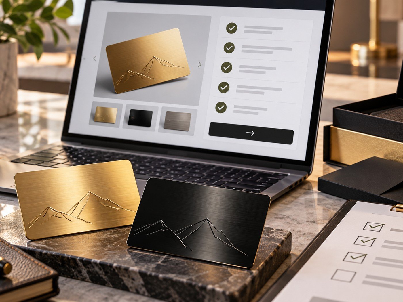
1. Start with the goal of the card
Before you pick colors or graphics, decide what this card needs to do. A personal keepsake card has a different job from a networking card. A gift card for a wedding should feel emotional and elegant. A business card should feel confident, clear, and easy to use.
When the goal is clear, the design becomes easier. You know whether the front should feature a monogram, a name, a scenic engraving, a bold brand mark, or a QR code that sends people to your contact details.
2. Choose the right style direction
Most strong card designs fall into one of three directions. The first is minimal and modern. The second is luxury and expressive. The third is personal and memorable. None is automatically better. The right one depends on your use case.
If you like elegant premium styles, the Golden Monogram Metal Card is a useful reference. If you want a darker and bolder look, the Midnight Signature Metal Card gives you a different mood.
| Style direction | Best for | What to keep in mind |
|---|---|---|
| Minimal and modern | Consultants, agencies, founders | Use fewer details and stronger spacing. |
| Bold and luxury | Premium services, personal brand cards | Choose one hero element and avoid clutter. |
| Personal and emotional | Gift cards, keepsakes, special occasions | Use a short message and one strong visual. |
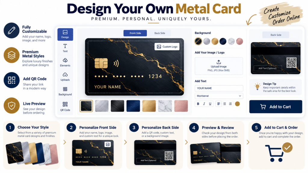
3. Build the front first
The front side creates the first impression. That is why it should carry the most important visual message. In many cases, the front only needs a logo, a name, a monogram, or one clean visual. The front becomes weaker when it tries to carry everything at once.
If you need help staying concise, draft your wording in the Word & Character Counter. It helps you trim long lines before you place them on a small card.
Use simple support tools before you upload
A few quick prep steps outside the designer can save time inside the designer. Resize an image, compress a heavy file, and make sure the final text fits well before you begin.
Helpful tools: Image Resizer · Image Compressor · Word & Character Counter
4. Use the back with purpose
The back should support the front, not compete with it. If the front is visual, let the back hold your details. If the front is minimal and text-based, the back can carry texture, a pattern, a short message, or a QR code that takes people to a website or digital contact page.
This is also the stage where file quality matters. If you are adding artwork, crop it cleanly with the Image Cropper and convert it if needed with the PNG, JPG & WebP Converter.
5. Review the final proof like a buyer, not a designer
Once the design looks good, stop editing and start reviewing. Check spelling. Check contact details. Look at alignment. Ask whether the contrast is strong enough. Then step back and ask the most important question: does this card feel premium, or does it feel busy?
A good proof review is often what separates a nice idea from a strong final product. If you want a dedicated review process, read our custom metal card order checklist.
- Know the goal of the card.
- Pick one clear style direction.
- Keep front-side content limited.
- Give the back a supporting role.
- Use sharp files only.
- Trim unnecessary text.
- Check contrast before ordering.
- Review both sides one last time.
Frequently asked questions
Can I design both sides of a custom metal card?
Yes. A better workflow is to decide the job of the front first, then use the back for secondary information, artwork, or a clean branded finish.
What should I prepare before using the card designer?
Prepare your name, role, contact details, logo or image files, preferred colors, and a clear idea of the finish you want.
Is a simple design better than a busy design?
In most cases, yes. Clean spacing and fewer elements usually look more premium and are easier to read on a small card.
2 Responses